
Ladies and Gentleman, Boys and Girls…it has finally arrived. The Hometown Remix program is here and we have a full breakdown of this new League-wide program.
When news of the Hometown Remix program was leaked earlier in the year, it raised a lot eyebrows on what this would entail. Then, over the summer, the NHL and Fanatics made the news official that this was happening.
This is the first time Fanatics itself has been a part of a League wide initiative so it is important that they get things right, given the critical responses that Fanatics has had over the years.
With that being said, let’s dive right into the review of all the jerseys for Hometown Remix with Brett from Brett’s Notes and our friend Scott Fairchild. You can hear Michael Lindenbaum and Russell Hartman’s thoughts on all 32 jerseys on The Morphinominal Hockey Show.
Anaheim Ducks
The Ducks dove right in and went with the colours from the Mighty Ducks movies from the 1990s, and it was the best thing possible. The team’s logo is also in the same colours, and it pulls the whole look together.
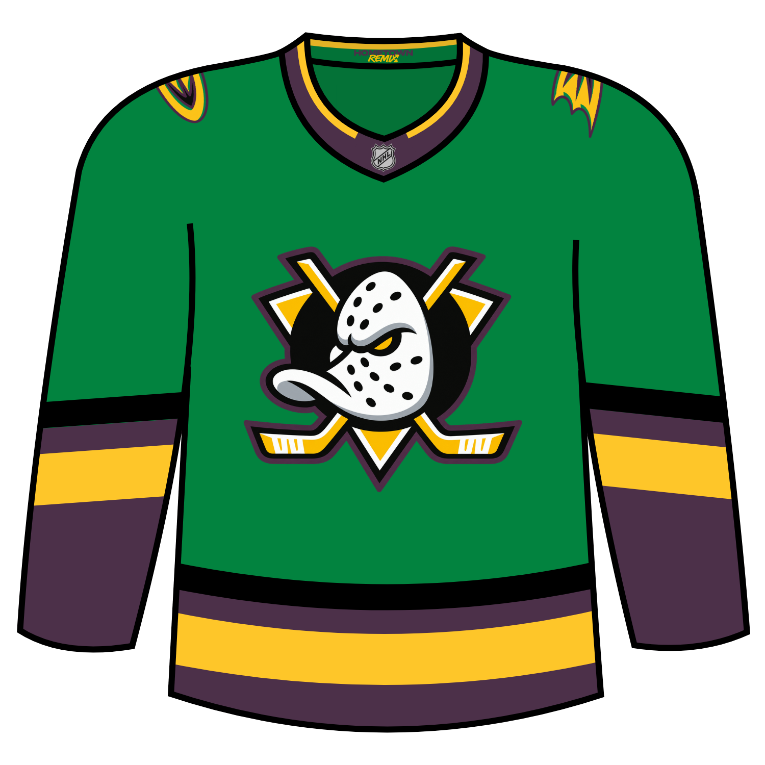
This becomes the 11th alternate jersey, which will be the subject of a much larger project, in the 30-plus year of the franchise, and the first since the 2023-24 season.
Anaheim will wear these jerseys on the following dates:
- Sunday, Nov. 8 – Pittsburgh Penguins, 5 p.m. (Uniform debut)
- Wednesday, Nov. 11 – Nashville Predators, 7 p.m.
- Friday, Nov. 27 – Los Angeles Kings, 1 p.m.
- Sunday, Dec. 6 – Winnipeg Jets, 5 p.m.
- Tuesday, Dec. 22 – Vegas Golden Knights, 6:30 p.m.
- Friday, Jan. 8 – Dallas Stars, 7 p.m.
- Tuesday, Jan. 12 – New York Rangers, 7 p.m.
- Wednesday, Feb. 24 – Seattle Kraken, 7 p.m.
- Friday, March 5 – Tampa Bay Lightning, 7 p.m.
- Thursday, March 18 – Utah Mammoth, 7 p.m.
Dickson’s take: I absolutely love everything about this jersey. Anaheim nailed it really took the idea of Hometown Remix the correct way.
Grade: A+
Brett: Really all they did was update the colors on their jerseys, but it just works. Great call back to the original Mighty Ducks jerseys. Think this would make a nice 3rd jersey for them
Scott: Love how it pays tribute to the Mighty Ducks movie that got this NHL franchise started in the first place…definitely a winning mix for a Ducks jersey! FLYING V!!
Boston Bruins
For the Boston Bruins, they played it safe but Boston also had fun with their rendition of Hometown Remix.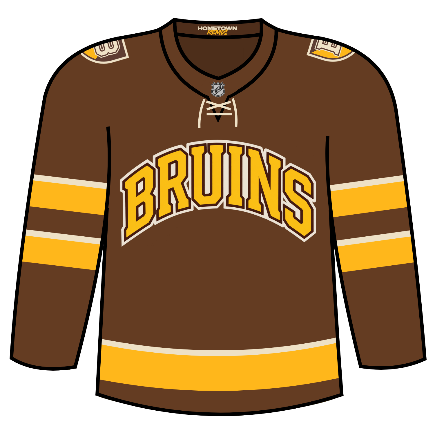
Boston decided to go with a college like feel, which the team dubbed Causeway University, which was a fun idea.
Boston used their original colours of brown as the base colour of the jersey with the iconic yellow, with the brown not being featured as a look on a jersey since 1924, and the front numbers on the jerseys is a look that hadn’t been seen since the 1940s.
Boston will wear their Hometown Remix jerseys on the following dates:
- Thursday, Nov. 12: Montreal Canadiens at Boston Bruins, 7:00 p.m. ET
- Saturday, Nov. 14: Minnesota Wild at Boston Bruins, 7:00 p.m. ET
- Friday, Nov. 27: Toronto Maple Leafs at Boston Bruins, 1:00 p.m. ET
- Saturday, Dec. 5: Detroit Red Wings at Boston Bruins, 1:00 p.m. ET
- Saturday, Dec. 12: New Jersey Devils at Boston Bruins, 1:00 p.m. ET
- Tuesday, Dec. 22: Boston Bruins at New York Islanders, 7:00 p.m. ET
- Wednesday, Jan. 6: Boston Bruins at Montreal Canadiens, 7:30 p.m. ET
- Saturday, Jan. 9: Boston Bruins at Detroit Red Wings, 7:00 p.m. ET
- Tuesday, Jan. 12: Carolina Hurricanes at Boston Bruins, 7:00 p.m. ET
- Saturday, Jan. 30: Toronto Maple Leafs at Boston Bruins, 7:00 p.m. ET
- Monday, Feb. 15: Anaheim Ducks at Boston Bruins, 2:00 p.m. ET
- Saturday, Mar. 6: Pittsburgh Penguins at Boston Bruins, 12:30 p.m. ET
Dickson’s Take: This was a fun idea for Boston. They had fun with the college idea and the entire Causeway University teasers pulled everything together nicely.
Grade: B
Brett: I love what they are going for here with the inspiration of college hockey. I think they nailed it and also even called back to their original jersey from the 1920’s. I don’t love brown as a main jersey color, but I think they nailed the concept.
Scott: A solid college hockey vibes type of design that works really well.
Buffalo Sabres
Buffalo played it as safe as possible for their edition and went with the Goathead design, but this time used it on their royal blue base colour. The sleeve striping uses a gold/white/gold on the arms and it repeats on the hem of the jersey.
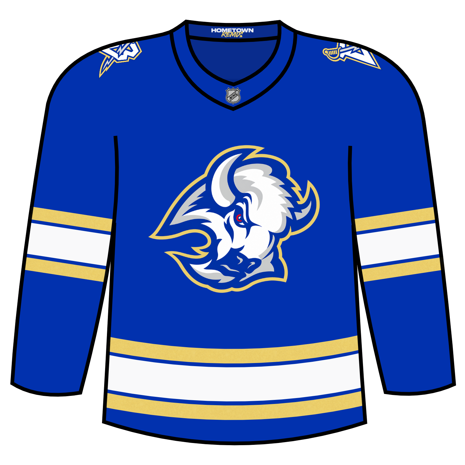
The shoulder logo brings back the “B sword” logo and keeps the colours of the overall look.
Buffalo will wear the jerseys on the following dates:
- Wednesday, Nov. 4 vs. Ottawa (7:30 p.m.)
- Wednesday, Nov. 25 vs. New York Rangers (7 p.m.)
- Friday, Dec. 18 vs. Montreal (7:30 p.m.)
- Monday, Dec. 28 vs. Detroit (7 p.m.)
- Saturday, Jan. 16 vs. Nashville (7 p.m.)
- Wednesday, Jan. 20 at New York Islanders (7 p.m.)
- Friday, Feb. 26 vs. Ottawa (7:30 p.m.)
- Thursday, March 4 vs. St. Louis (7 p.m.)
Dickson’s Take: I wish Buffalo would have done something a bit more fun but to me this just feels like it is a rejected concept jersey from the Reverse Retro program.
Grade: C
Brett: This feels a little too plain for me, considering what we saw other teams do. Is it a good jersey? Yes, I think if they introduced this as another alternate jersey, that’d be great. Just don’t think it does a great job of being a Hometown Remix jersey.
Scott: Blue/gold and the goat head equals a great combo here.
Calgary Flames
Calgary decided to play homage to the final season of the Calgary Saddledome for their Hometown Remix jersey. Calgary kept the iconic red as a base colour and flipped the colour of the iconic “C” logo.
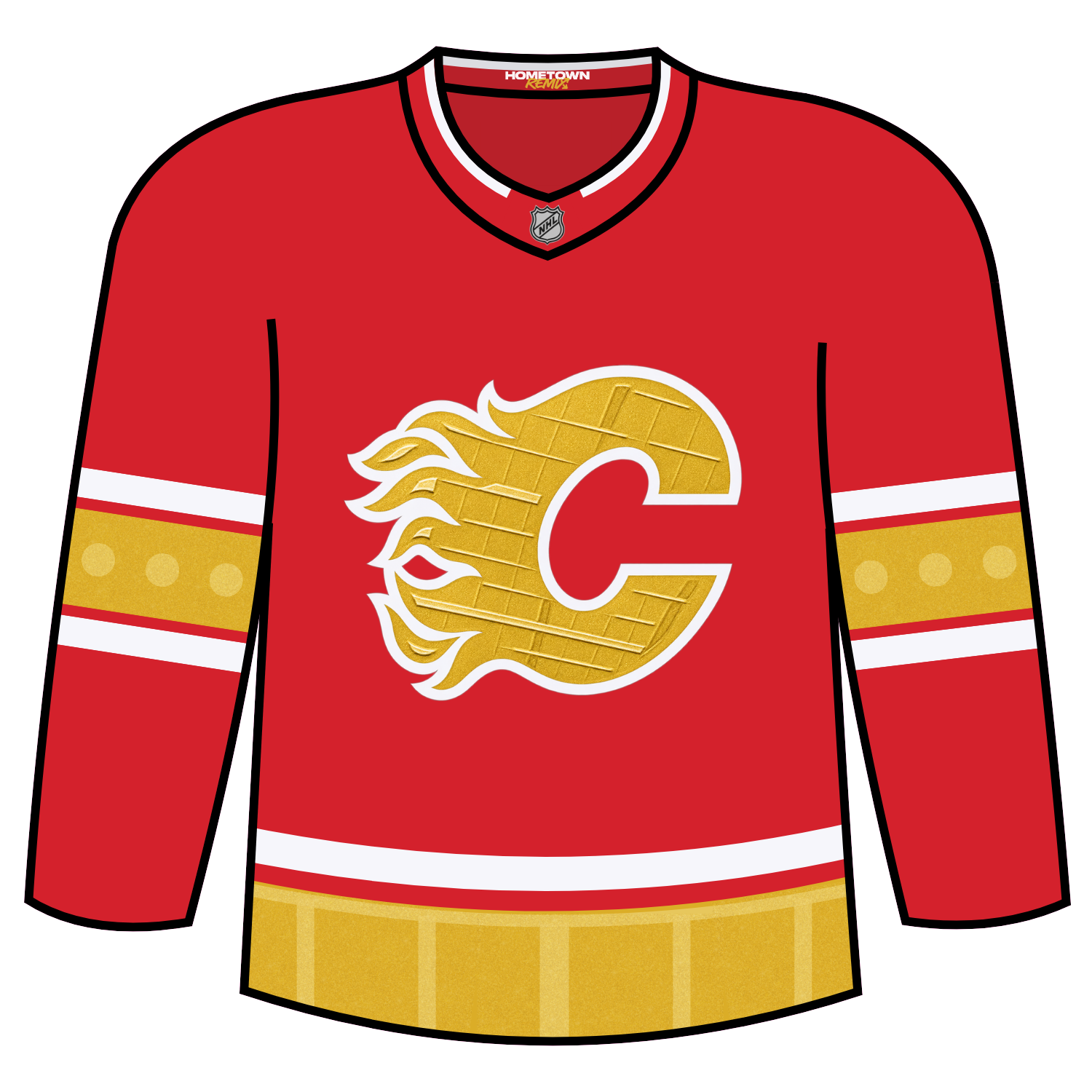
The detail inside of the “C” logo uses the interior of the roof of the Saddledome and it pays a very nice tribute of sorts to final year in the historic arena.
Calgary will wear this jersey for the following games:
- • Friday, November 6th, 2026, vs. Anaheim Ducks
- • Sunday, November 8th, 2026, vs. Philadelphia Flyers
- • Wednesday, November 11th, 2026, vs. New York Rangers
- • Thursday, December 3rd, 2026, vs. Buffalo Sabres
- • Saturday, December 5th, 2026, vs. Washington Capitals
- • Tuesday, December 8th, 2026, vs. Nashville Predators
- • Tuesday, January 12th, 2027, vs. Columbus Blue Jackets
- • Thursday, January 14th, 2027, vs. San Jose Sharks
- • Saturday, January 16th, 2027, vs. Los Angeles Kings
Dickson’s Take: After seeing the what they did for the Saddledome tribute, I like this. I am happy that they did not use Blasty, as much as I love the Blasty look, as the tribute.
Grade: B
Brett: I love that they went all in with the inspiration of their building. The logo takes architecture from the ceiling, the stripe on the lower torso shows off that saddleback shape, and the details of the windows on the sleeves. I think they did a great job of honoring their building here.
Scott: I understand the intention was to honor the end of the Saddledome era, but I can’t unsee an Eggo waffle. I’m sorry, but that’s what it looks like! Leggo my Eggo baby!
Carolina Hurricanes
Carolina decided to go with a ‘storm gray’ colour, which is a bit fitting for the team. The main logo on the jersey features “Struttin’ Stormy”, which has been a shoulder logo on their white jersey and ties together the university feel.
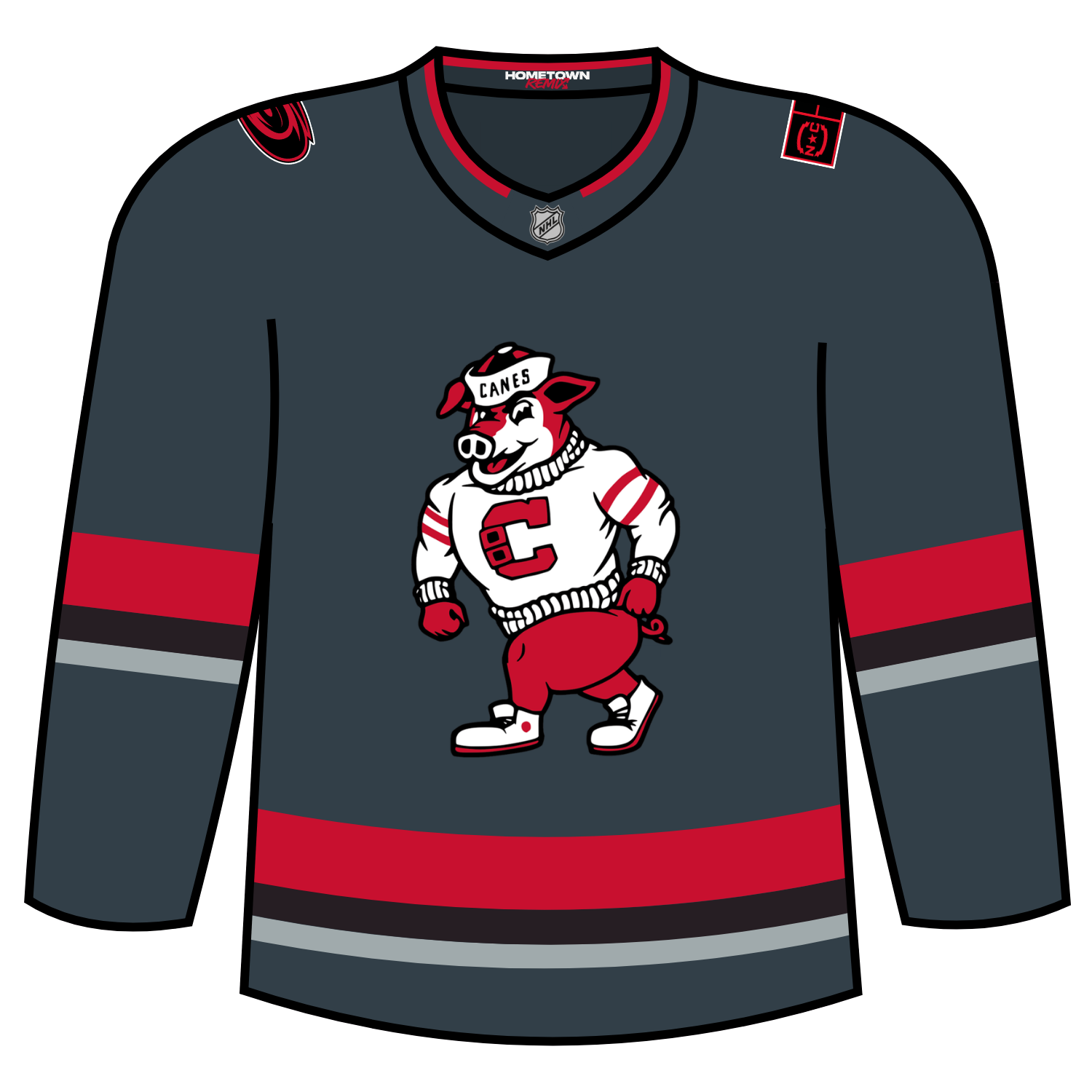
There is a red/black/silver striping effect on the arms but the hem striping goes silver/black/red. The red in the arms contains oak tree leaves, which is a very nice add detail.
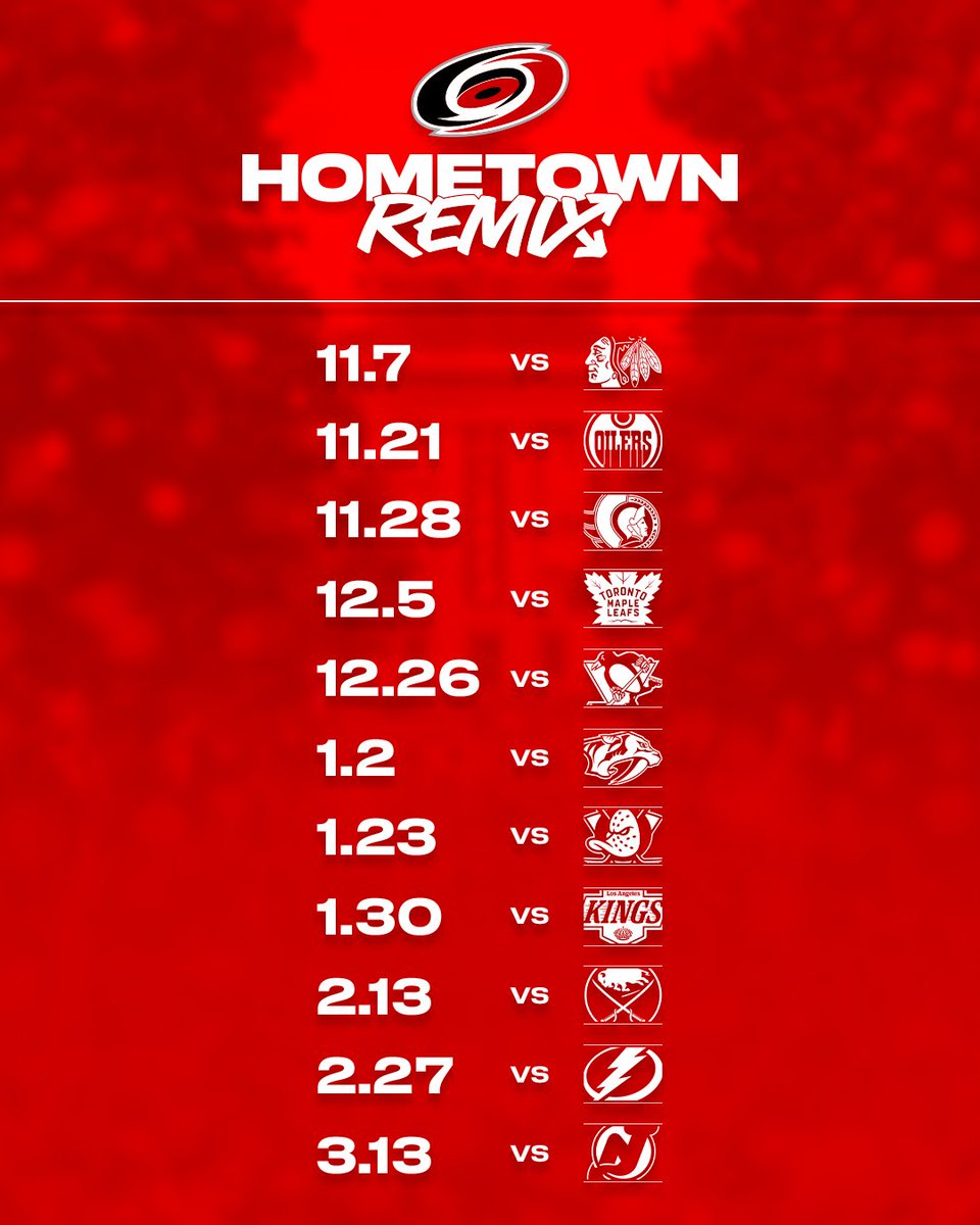
Carolina plans to wear their Hometown Remix jersey for the following contests:
Dickson’s Take: I wanted to hate the idea of a gray colour for Carolina but in the end, it made the most sense. I do think that Carolina should have tried to pay more homage to the city of Raleigh, though.
Grade: C
Brett: I think it’s okay. I like Struttin’ Stormy as a center crest, the little homage to the city’s capital building on the left shoulder is cool, and the oak leaves on the sleeve striping. Just not loving the color combo, particularly the dark gray as the main.
Scott: I do like what they tried to do with the college vibes and a tribute to neighboring North Carolina State.
Chicago Blackhawks
Chicago for their Hometown Remix paid homage to a 1961 connection, in which plumbers in the city discovered that the Chicago River could be safely dyed green, a tradition that happens every St. Patrick’s Day.
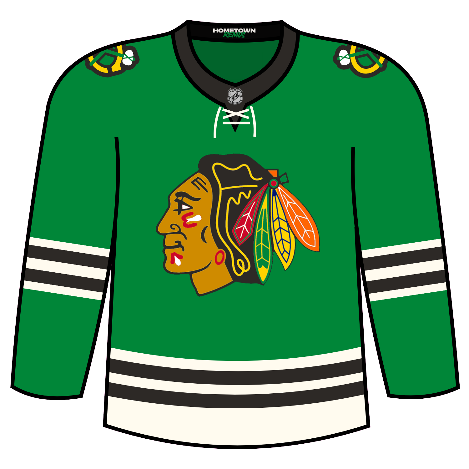
There is also the laced up collars from the 1960s, as well as the striping from the franchises 1961 Stanley Cup win.
Chicago will wear their Hometown Remix jersey on the following dates:
- November 2 vs. Colorado Avalanche
- Dec. 29 vs. Vegas Golden Knights
- March 8 vs. Tampa Bay Lightning
- March 10 vs. Washington Capitals
- March 14 vs. Anaheim Ducks
- March 16 vs. San Jose Sharks
Dickson’s Take: While I understand the green aspect of the jersey, I really wish there could have been more done to honour/bring in the Hometown Remix concept.
Grade: D
Brett: It’s boring and has been done before as their St. Patrick’s Day jersey. They made some slight changes with an additional stripe on the sleeve and doing a more cream white, but at face value, just not enough creativity here.
Scott: This looks like a St. Patrick’s Day jersey. Seriously, that’s the first thing that comes to mind. Not exactly the creative hometown remix I was hoping to see from a historic franchise like the Chicago Blackhawks. I get what they were trying to do as the city dyes the Chicago River for St. Paddy’s Day, but man they definitely missed the mark here & could’ve done much better than this.
Colorado Avalanche
Colorado’s Hometown Remix jersey features a mostly white body, has blue stripes on the sleeve with mountain peaks near the shoulder.
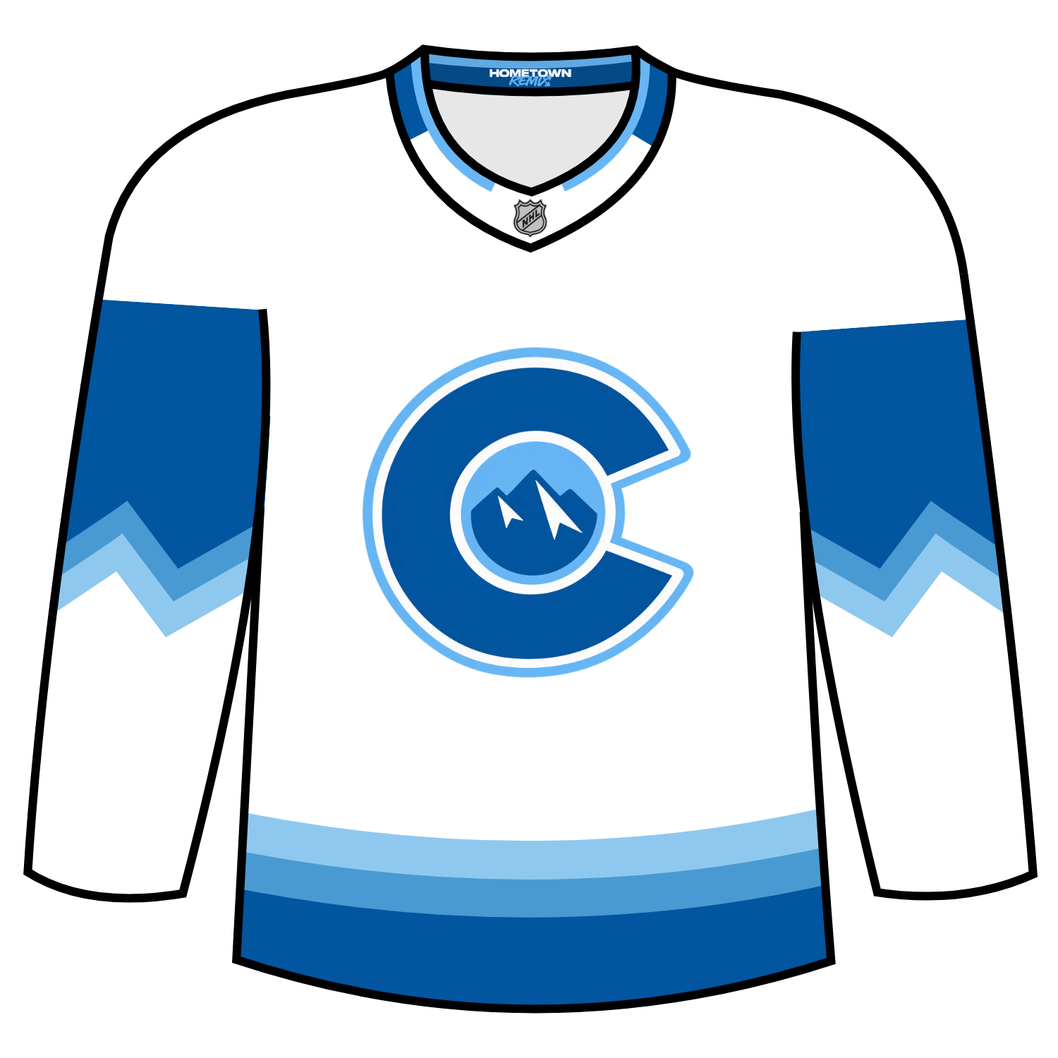
The Avs logos shifts to the shoulders and the alternate “C” logo will be front and center, much like it was featured on the 2016 Stadium Series jersey.
The Avs Hometown Remix jersey will be worn for six contests:
- Nov. 7 vs Detroit
- Nov. 27 at Minnestoa
- Nov. 28 vs. San Jose
- Dec. 12 vs. Washington
- Jan. 8 vs. Seattle
- Feb. 22 vs Vegas
Dickson’s Take: I don’t like this for the Avalanche. I get where they were going but I would have liked to have seen Colorado do two things:
- Bring back the Yeti foot logo as the center crest
- Use a lighter blue colour
Grade: D
Brett: This I think absolutely hits as a Hometown Remix jersey. It gives some major skiing vibes, which is a defining aspect of the Colorado rocky mountains. The mountains on the shoulder are fun and well executed. Great color combo as well.
Scott: I do like the fact that the Avs took a risk here, but still prefer their navy blues over this.
Columbus Blue Jackets
The Columbus Blue Jackets design features an arched sleeve design complete with a debossed filigree pattern behind the sleeve numbers.
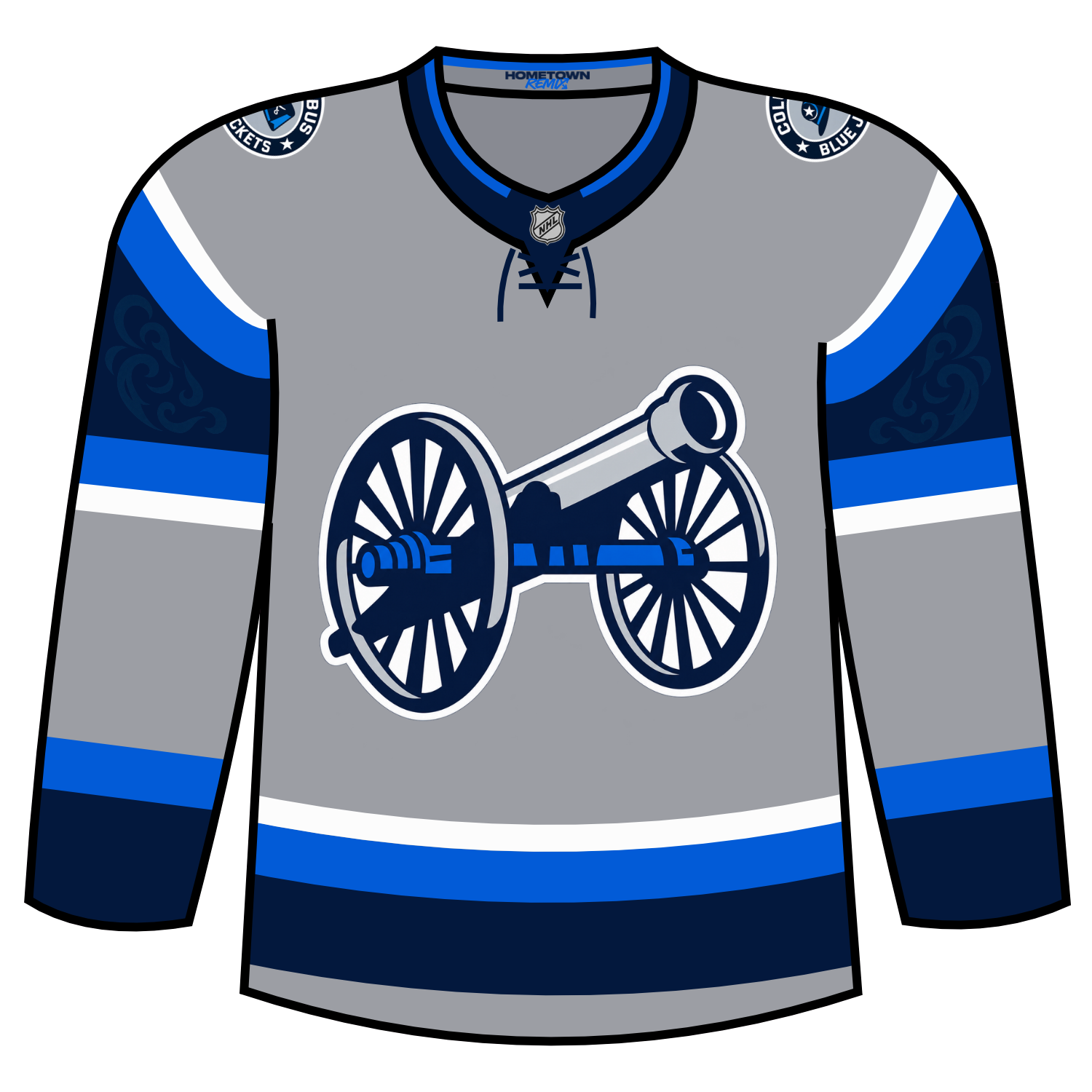
The base of solid grey is the perfect colour to feature cannon crest (which I will get to in a minute) and player numbers, both outlined in white for maximum impact. The two-tone blue on the arched sleeves is also a perfect balance of colour and doesn’t distract from the rest of the look.
Columbus will wear this jersey for 13 games:
- Tuesday, November 3 – vs. Colorado Avalanche – 7 p.m.
- Thursday, November 5 – vs. Dallas Stars – 7 p.m.
- Tuesday, November 10 – vs. Florida Panthers – 7:30 p.m.
- Thursday, November 12 – vs. Tampa Bay Lightning – 7 p.m.
- Wednesday, November 25 – vs. New Jersey Devils – 7 p.m.
- Friday, November 27 – vs. Detroit Red Wings – 3 p.m.
- Thursday, December 10 – vs. Minnesota Wild – 7 p.m.
- Tuesday, December 15 – vs. Carolina Hurricanes – 7 p.m.
- Thursday, December 17 – vs. Seattle Kraken – 7 p.m.
- Tuesday, December 22 – vs. Montreal Canadiens – 7 p.m.
- Sunday, December 27 – vs. Edmonton Oilers – 6 p.m.
Dickson’s Take: I love everything about this jersey for Columbus. I loved how they pulled from the 2024 Stadium Series jersey with the cannon logo and used it as the main logo. I feel that if the Blue Jackets ever did a re-brand, they need to use that as the main logo.
There are a couple of minor issues that I have, mainly the outline treatment on the numbers, but again it is a minor issue.
Grade: A-
Brett: Another gray based jersey in this collection, and another one I just don’t like that much. The unique shoulder striping is the one thing I like in this jersey. Just doesn’t really feel too much like a Hometown Remix jersey for me.
Scott: The cannon is a solid look for the Blue Jackets. Nice job here.
Dallas Stars
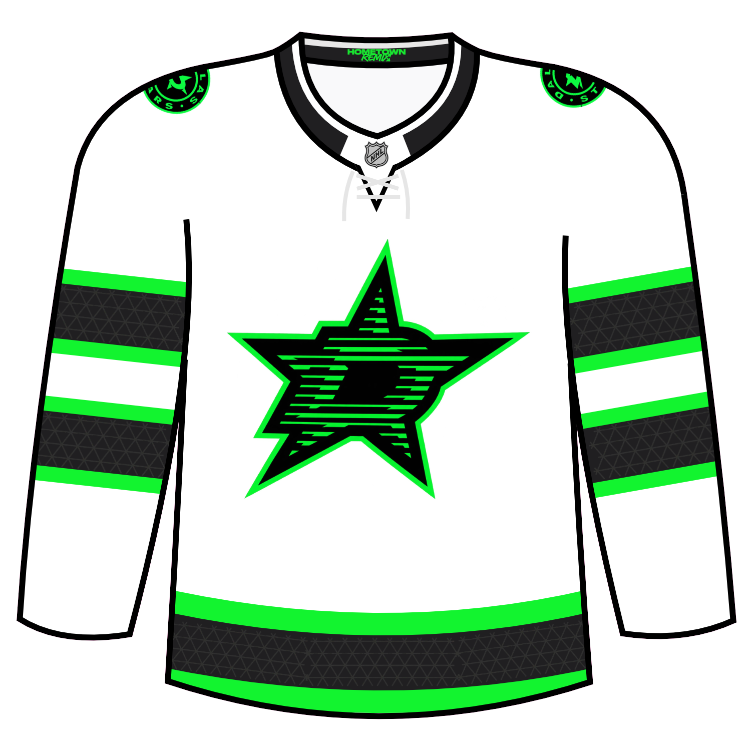
Dallas’ Hometown Remix is purported to pull from the iconic landmarks of the city as well as neon looks.
Dallas will wear this jersey for five dates:
- November 25 v. Nashville Predators
- November 27 at St. Louis Blues
- December 31 v. New York Rangers
- January 4 v. Detroit Red Wings
- January 30 at Minnesota Wild
Dickson’s Take: I understand the love for the neon theme for the Stars, especially with how long their “Rave” jerseys stuck around. However, I would have liked to have seen Dallas have more of a Rodeo theme or do something more Lone Star State themed.
Grade: D+
Brett: I personally loved the black and neon green jerseys the Stars did for awhile, but this one is not doing it for me. I think the logo is too busy and I don’t really get what they were going for there. Just feels like they did a Reverse Retro of those old black jerseys.
Scott: No comment.
Detroit Red Wings
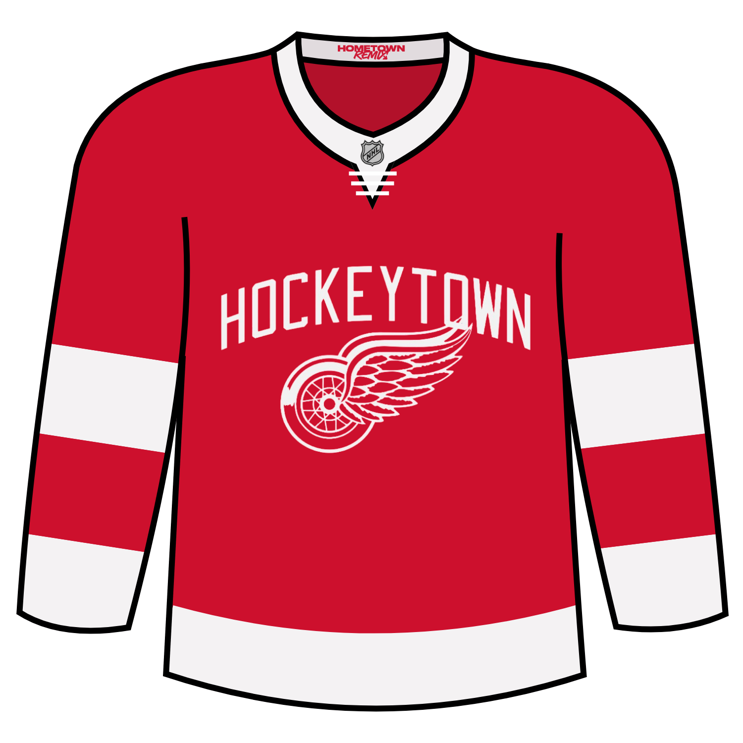
The Red Wings went far too comfortable for their Hometown Remix look. The front of the jersey features the iconic winged wheel logo with their “Hockeytown” moniker written above. The color scheme remains faithful to the traditional red and white fans are accustomed to with thick added white stripes added to the cuffs of the jersey.
The Red Wings will wear this jersey for the following games
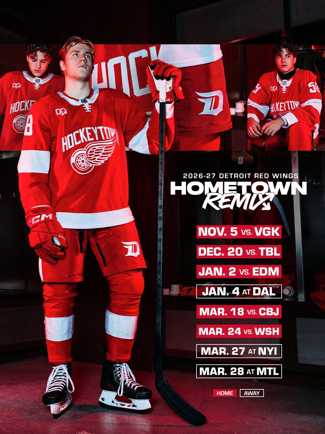
Dickson’s Take: I get it is the Red Wings but they put no effort in on this one. At all.
Grade: F-
Brett: I do like the Hockeytown wordmark getting put on the centercrest, but there is so little effort given here. They did put effort into the bottom hemline by adding the octopus and having fun with that, but wish that creativity could’ve shown up in the rest of the jersey.
Scott: No comment.
Edmonton Oilers
Edmonton’s Hometown Remix jersey is featured in a black aesthetic that also has a touch of a dark gray with orange. The striping is in the traditional sense and contains the “Oil Country” patch on the left shoulder while the right shoulder has the “Oil Rig” worker that was last seen on a jersey in 2007.
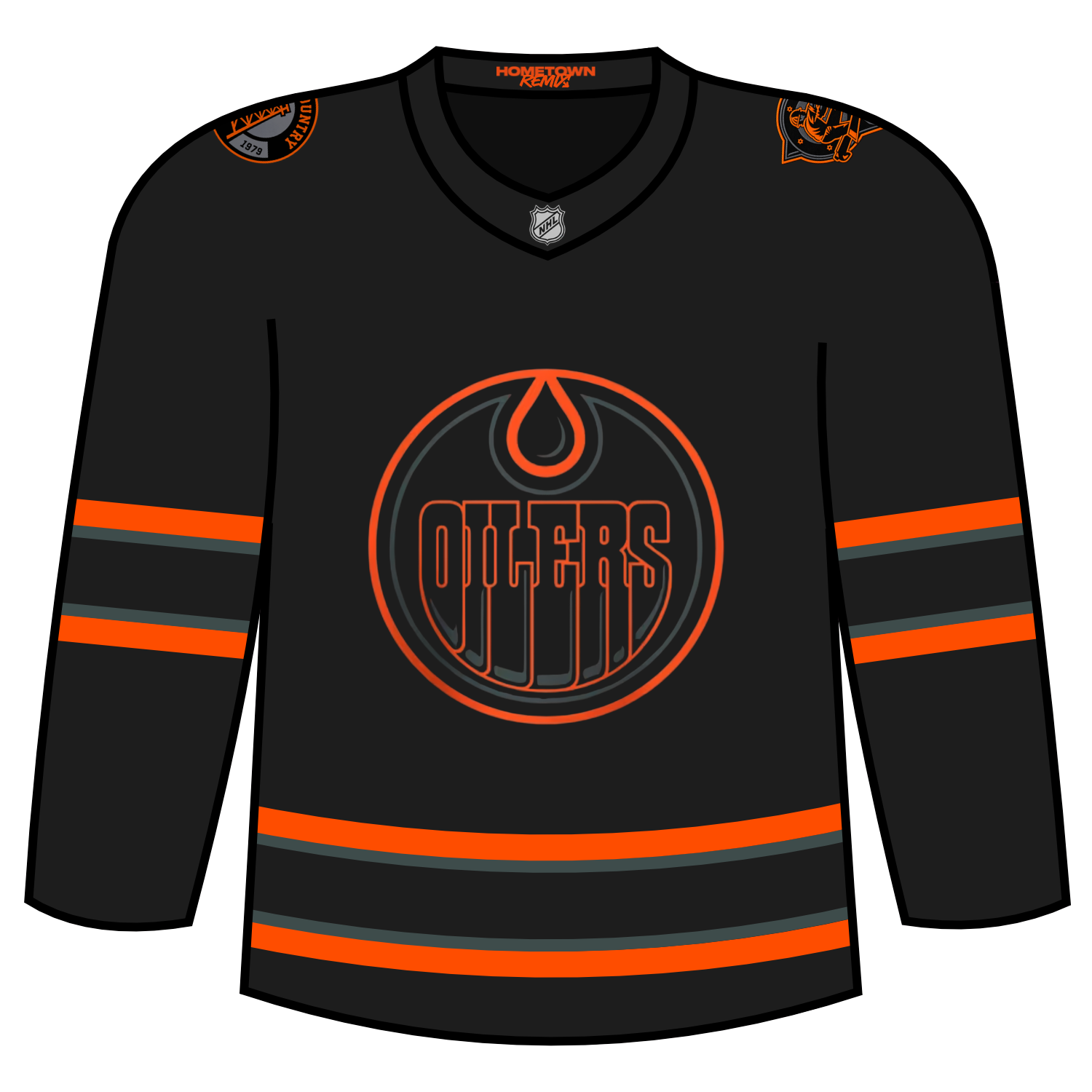
The Oilers Hometown Remix Jersey will be worn for seven contests

Dickson’s Take: I’m personally not a fan of the black for Edmonton but it makes sense with the whole Oilers theme. At least is it not a jersey that was all orange with black accents.
Grade C-
Brett: I actually kind of like it. Really leaning into the “oil” aspect of Edmonton with the full black unis. The orange nicely accents it. Love the shoulder patches as well. I do agree with many Oiler fans though that the oil rig worker should’ve been the center crest.
Scott: Meh, would’ve liked to see a bit of a nod to oiling here.
Florida Panthers
Florida’s Hometown Remix is the perfect Miami vibes. The pink base colour with the orange and yellow stripingsbefore turning to blue down the arms brings in an old look with the jersey. A colour correct vibe with the main logo on the arms adds to the jersey while bringing back the sunshine, palm tree and hockey stick back as the main logo.
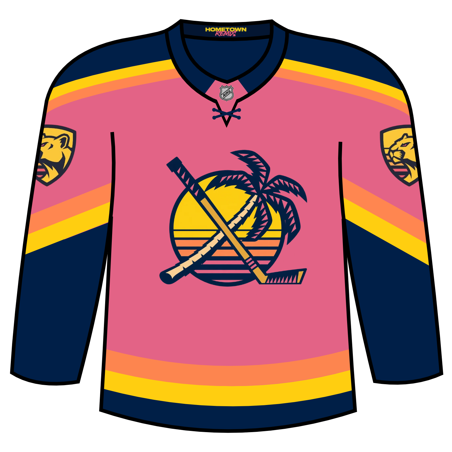
Florida will wear this jersey for the following ten contests:
- Nov. 2 vs. Detroit
- Nov. 4 vs. Chicago
- Nov. 28 vs. Tampa Bay
- Dec. 19 vs. Calgary
- Dec. 26 vs. Tampa Bay
- Jan. 2 vs. Montreal
- Jan. 16 vs. Las Vegas
- Feb. 13 vs. Dallas
- March 6 vs. Toronto
- March 27 vs. Philadelphia
Dickson’s Take: When the Florida Panthers jersey was first leaked back in the spring, it was, at least for me, jarring. I got the Miami vibes but something didn’t feel right. After seeing them debut on the ice, they were absolutely perfect and it 100% fits the Hometown Remix theme.
Grade: A+
Brett: I’ve got to be honest, I hated this jersey when it leaked. Pink? Come on. But it has grown on me and you can’t deny it absolutely fulfills what this line of Hometown Remix jerseys is supposed to be. You get the effect of a Florida sunrise with the logos and the striping, and the “Coral Sunrise” color fits the Florida beach vibe.
Scott: My number one! Absolutely nailed the design. Great colors and I love the Sunset and South Florida Beach vibes! Definitely seeing myself where this around for style and especially if I go back down to South Florida on vacation and catch a Panthers game.
Los Angeles Kings
Los Angeles did a mix and match of all identities they have had over their 60 years of hockey in Tinseltown and everything works pretty well.
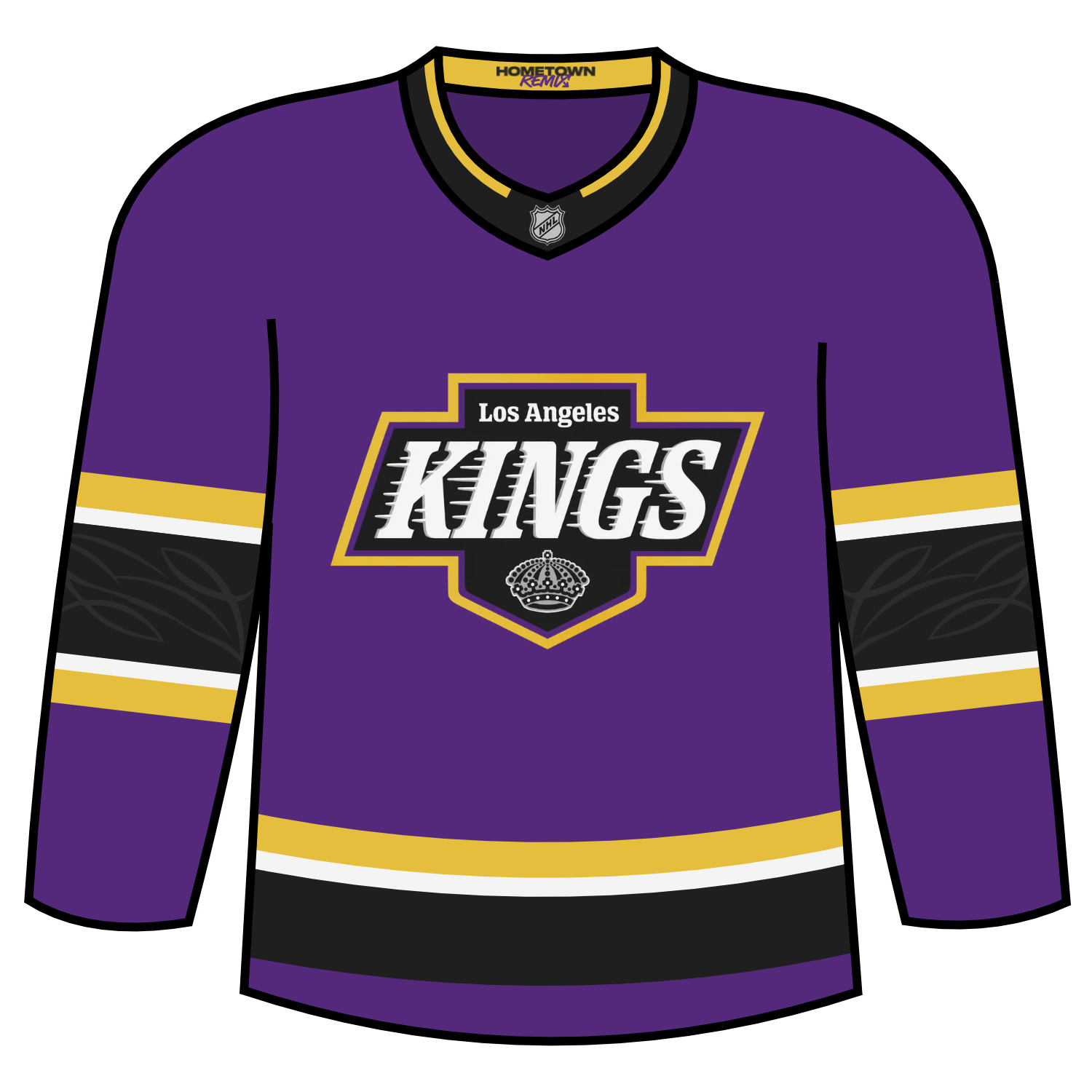
The Kings will wear this jersey for the following contests:
- November 4 vs. San Jose
- December 9 vs. San Jose
- December 30 vs. Toronto
- January 6 vs. Washington
- January 13 vs. St. Louis
- March 3 vs. Tampa Bay
- March 31 vs. Winnipeg
Dickson’s Take: Love it. I know the Kings seem like they have had an identity crisis and they can never pick a look but I am 100% not mad with this look at all. The mix of the purple (yes I know it’s Forum Blue), yellow, black, and silver make this look beautiful.
Grade: A+
Brett: I think this is a great jersey. It’s great to bring purple back into the Kings’ colors. The black and white is considered iconic because it’s what Gretzky wore, but yellow, gold, and black is such a great color combo. They recently did a rebrand, so I don’t suspect they would do this, but it would be really cool if the Kings did these colors full time.
Scott: Solid, but the Los Angeles Kings are running out of ideas.
Minnesota Wild
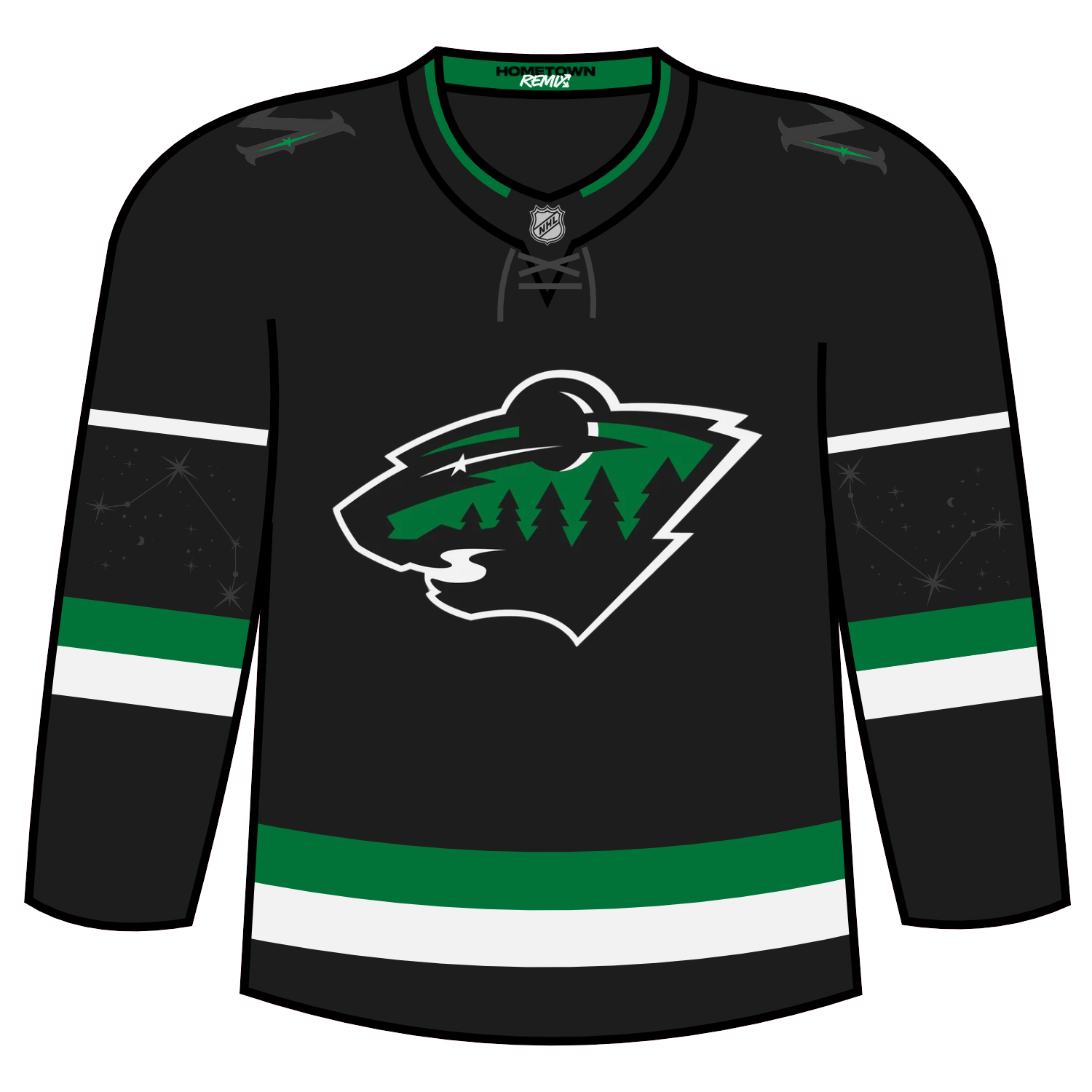
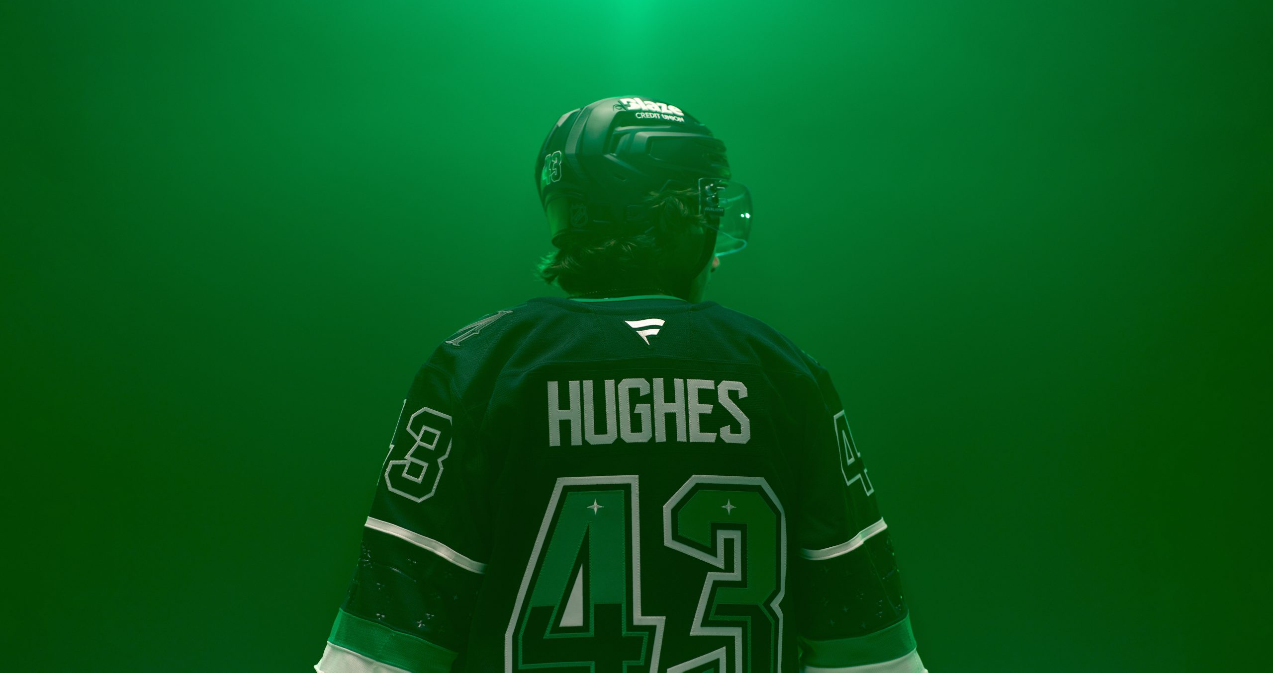
Minnesota’s Hometown Remix is a unique one in multiple ways. The Wild crest transforms from a daytime like feel to a nighttime feel. The sleeves bring the North to life with the Ursa Major and Ursa Minor constellations in a debossed look, while the numbers feature two twin stars to represent the Twin Cities.
Minnesota will wear their Hometown Remix jerseys for the following contests:
- Tuesday, November 17 vs. Nashville
- Friday, November 27 vs. Colorado
- Thursday, December 10 at Columbus
- Saturday, December 12 vs. Winnipeg
- Saturday, December 26 vs Winnipeg
- Saturday, January 2 vs. St. Louis
- Thursday, January 14 vs. Florida
- Thursday, January 21 vs. Detroit
- Tuesday, February 23 vs. Pittsburgh
- Friday, March 19 vs. Calgary
Dickson’s Take: I love the nighttime feel on the logo. It is absolutely perfect and the addition of the constellations in the sleeve is awesome!
Grade: A
Brett: I really like this jersey. They are going for a nightsky vibe, and they absolutely nailed that. Love the constellations integrated into the sleeve striping and the alteration to the main logo. I think it’s great.
Scott: I loved the night sky look of the jerseys, super cool and creative! Constellations on the sleeves are a very nice touch as well.
Montreal Canadiens
Montreal’s Hometown Remix plays on a different community aspects.
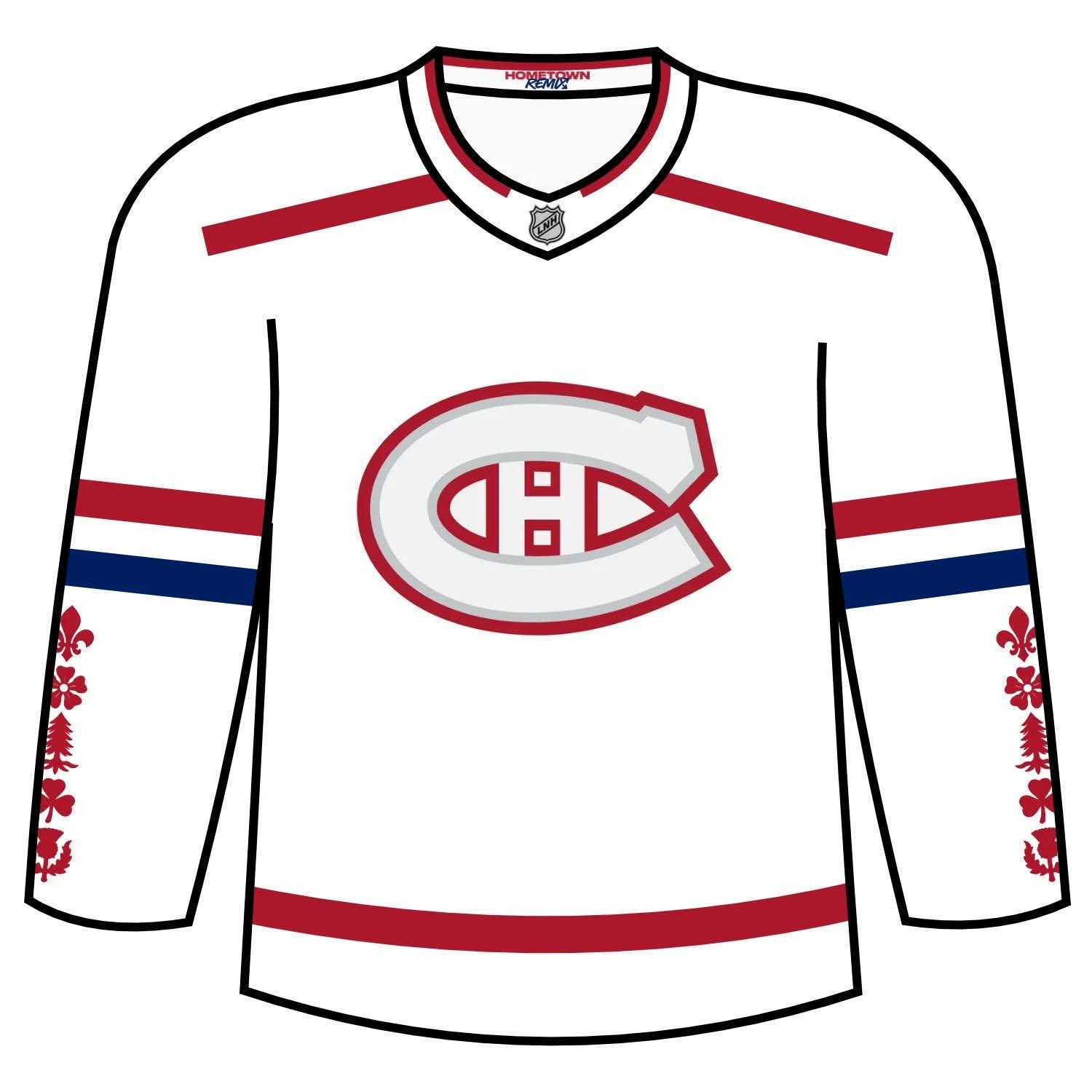
The Canadiens’ Hometown Remix jersey features white pine, fleur de lies, rose, thistle, and clover, each proudly adorning the sleeves and Canadiens crest includes etched architectural detailing that is a nod to the city’s iconic stonework and historic streets.
On the hem, four fleur de lys bookend the city name, grounding the jersey in Quebec pride. Montreal’s jersey is a tribute to culture, community, and the city’s timeless spirit.
Montreal will wear their Hometown Remix jerseys for the following contests:
- Tuesday, November 3, 2026 vs Winnipeg Jets
- Saturday, November 7, 2026 @ Toronto Maple Leafs
- Thursday, November 12, 2026@ Boston Bruins
- Saturday, November 14, 2026 vs Colorado Avalanche
- Monday, November 23, 2026 vs Los Angeles Kings
- Tuesday, December 8, 2026 vs Vegas Golden Knights
- Sunday, December 27, 2026 vs Dallas Stars
- Wednesday, January 6, 2027 vs Boston Bruins
- Saturday, January 23, 2027 vs Calgary Flames
- Saturday, March 28, 2027 vs Detroit Red Wings
Dickson’s Take: I love that Montreal didn’t deviate from their identity too far but also understood the assignment and used Hometown Remix in the right way.
Grade: A
Brett: The Canadiens often fall into a category of not being creative enough, but that is not the case with their Hometown Remix jersey. This feels new with it still clearly being the Montreal Canadiens. I like the inspiration taken from the flag of Montreal with the 5 icons on the sleeves. The only thing I don’t like is that red gradient thing going on on the sides of the torso. Should’ve left that out.
Scott: Solid and something a bit different for the Habs.
Nashville Predators
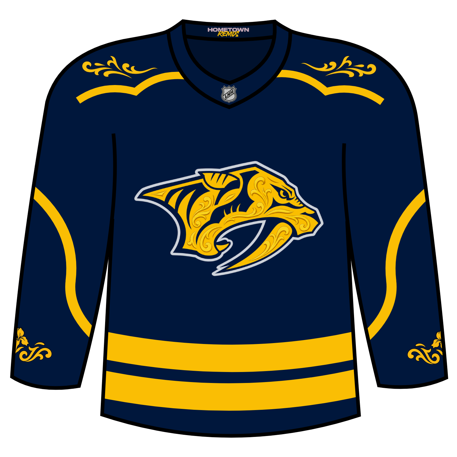
Nashville’s Hometown Remix brings full-on, all-in Nashville energy to Predators’ jerseys, complete with rodeo-like themes. The crest features tonal filigree detailing, as an homage to country-like wear and those elements continue through the sleeves. On the yoke, there is detailing in the sleeve filigree that also has an iris for Tennessee pride. And on the hem, matching filigree frames the city name in true Nashville fashion.
Nashville will wear this for the following 10 games:
- Nov. 7 vs. St Louis
- Nov. 21 vs. Pittsburgh
- Nov. 25 at Dallas
- Dec. 5 vs. Columbus
- Dec. 26 vs. Detroit
- Jan. 23 vs. Los Angeles
- Feb. 13 vs. Anaheim
- Feb. 27 vs. Los Angeles
- March 6 vs. Minnesota
- March 20 vs. Boston
Dickson’s Take: Love that they did a few things here.
- Navy base colour. Nashville, please do more of this
- Took the Hometown Remix jersey concept and went with it fully
- Love all of country music like vibes to the entire look.
Nashville nailed this one out of the park for sure.
Grade: A+
Brett: This is a really fun jersey and definitely hits the mark of being a Hometown Remix jersey. You can’t look at the details on this one and not instantly think “Nashville.” Gives the country music vibes they are going for without overdoing it.
Scott: Again, I have respect for another franchise trying to do something different and is definitely a step up from their stadium series jerseys from a few years ago.
New Jersey Devils
New Jersey, for their Hometown Remix, went safe for their rendition. They essentially did a colour flip of what was worn for the 2024 Stadium Series jersey, with some embossed detailing in the sleeves.
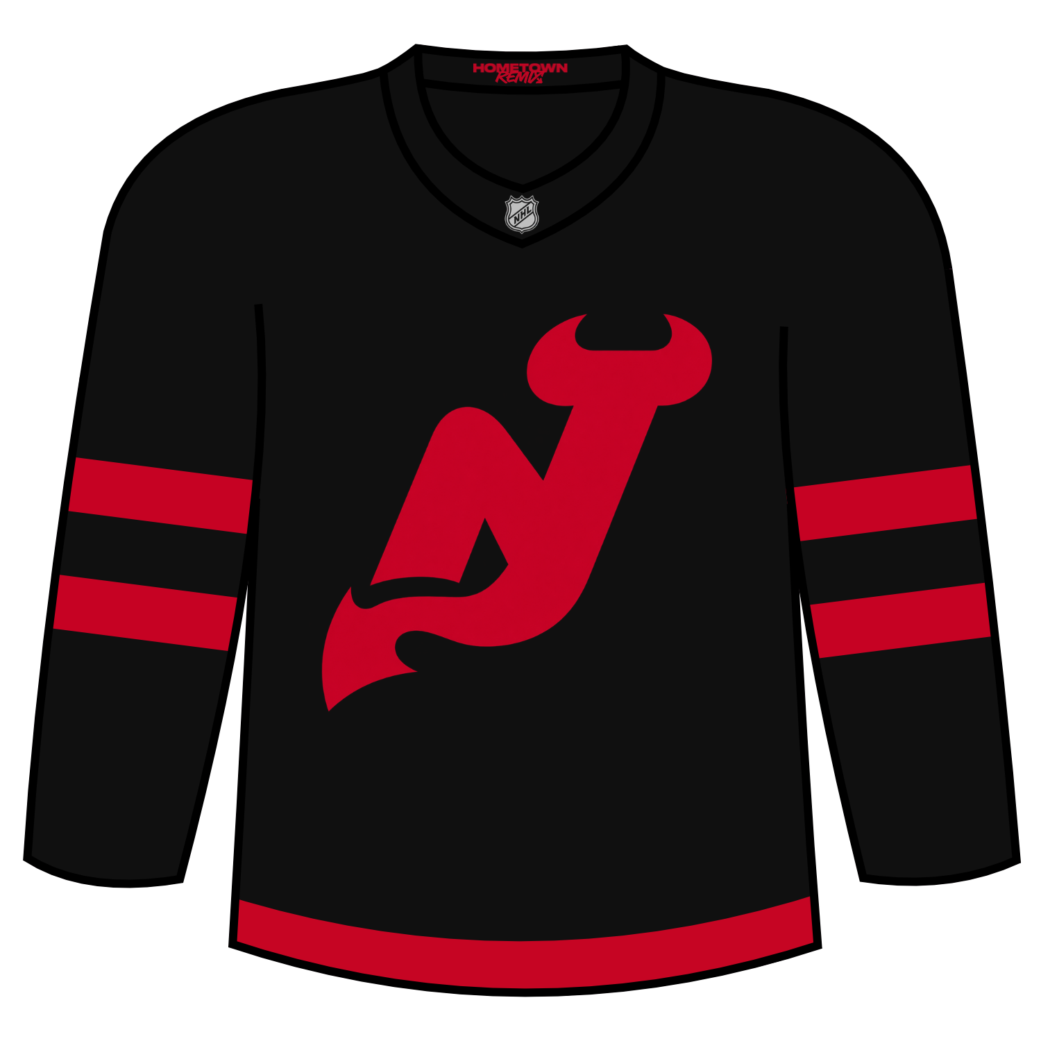
This jersey will be worn for 10 games:
- Nov. 18 vs. Montreal Canadiens
- Nov. 27 vs. Calgary Flames
- Nov. 28 vs. Winnipeg Jets
- Dec. 15 vs. New York Rangers
- Dec. 17 vs. Toronto Maple Leafs
- Jan. 16 vs. New York Islanders
- Jan. 19 vs. Dallas Stars
- Feb. 23 vs. Carolina Hurricanes
- Mar. 23 vs. Philadelphia Flyers
- Mar. 29 vs. Carolina Hurricanes
Dickson’s Take: Yawn. I wasn’t a fan of the 2024 Stadium Series jersey and I am not a fan of this. Much like Detroit, New Jersey completely missed the assignment.
Grade: F
Brett: This would be a great third jersey for the New Jersey Devils, but is a horrible Hometown Remix. Not creative enough on this one.
Scott: Finally! What the “Jersey Jersey” should’ve looked like in the first place! As a Devils fan and a guy from Jersey, chefs kiss right here! Very well done Devils!
New York Islanders
New Jersey’s Hometown Remix righted a wrong from the past. The Fisherman logo that was seen on the Reverse Retro 2.0 jersey has returned, but on a white jersey.
This is absolutely perfect works far better than the original
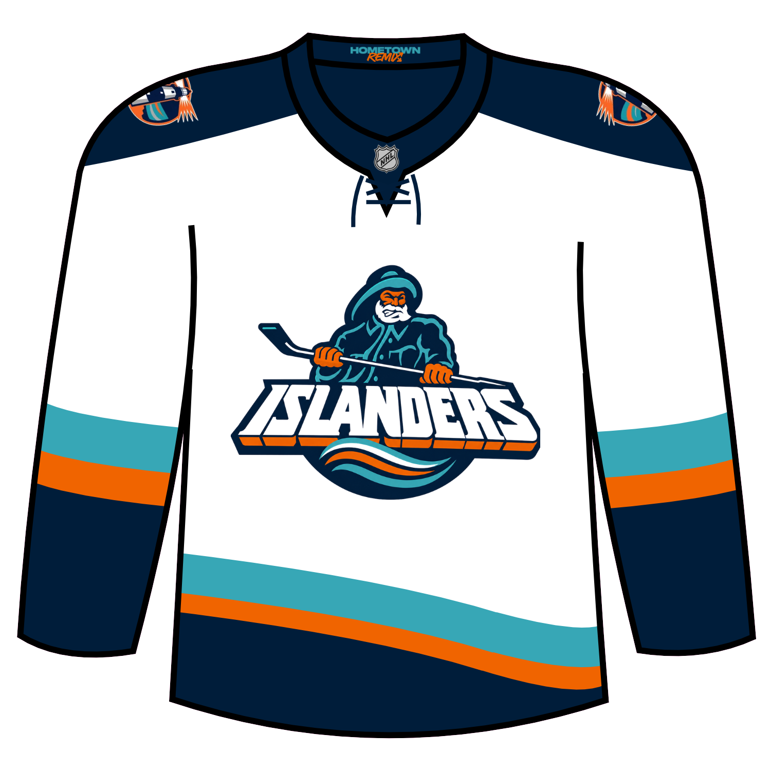
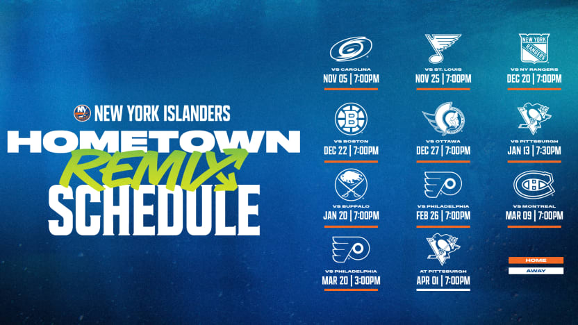
The Islanders will wear this jersey for the following dates:
Dickson’s Take: Love it. Love everything with it. No other notes.
Grade: A+
Brett: To me, this just feels like another 90’s throwback jersey. I am not getting Hometown Remix from it. If they want a Fisherman logo third jersey, do that. I think they could’ve tried to be more creative on this one.
Scott: Can we please move on from the Fisherman already? I know there’s nostalgia attached to that logo, but it feels like we’ve seen enough of it. More importantly, I’m not sure it really captures what Long Island represents. There’s so much more to Long Island’s identity, culture, and coastal character that the Islanders could have drawn inspiration from. I would have loved to see something that felt more representative of Long Island rather than another trip down the Fisherman nostalgia lane. Time to say bye, bye, Fisherman!
New York Rangers
The New York Rangers for their Hometown remix retained the navy blue base colour but used New York in the diagonal lettering that had not been seen on a jersey since the home debut after the 9/11 attacks.
On the left shoulder is the NYR Lady Liberty logo with the a Captain’s patch under. The lettering of that Captains patch is loosely inspired by the FDNY/NYPD badges that honour the first responders of the city.
In the red striping is debossed effects from the base of the Statue of Liberty.
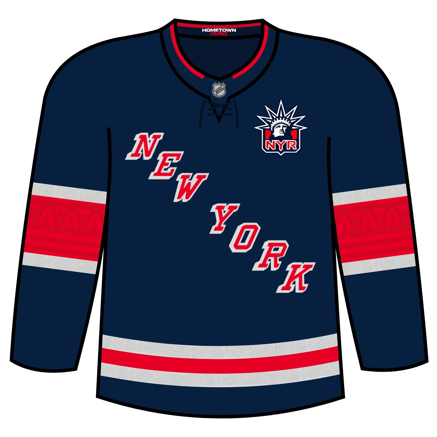
The Rangers will wear their Hometown Remix on the following dates:
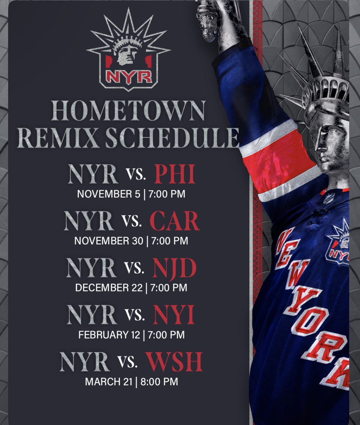
Dickson’s Take: I completely understand what they are going with for the Statue of Liberty vibes but I would have liked to have seen more architecture tributes made for the jersey.
Grade: C
Brett: It’s a little boring. Doesn’t feel like they tried to do anything new. They could’ve leaned heavier into the Statue of Liberty inspiration if they wanted to. I do love the details on the striping on the sleeves though.
Scott: We have seen this look before, but I do like the tribute to the NYFD on the captain patches.
Ottawa Senators
Ottawa’s Hometown Remix jersey took inspiration from the iconography of the city through the architecture and craftmanship.
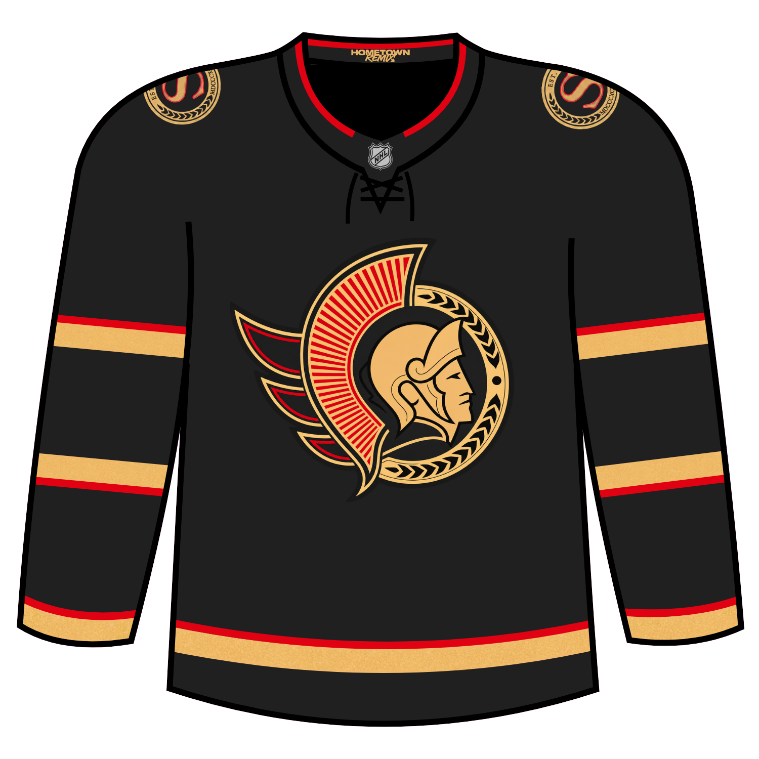
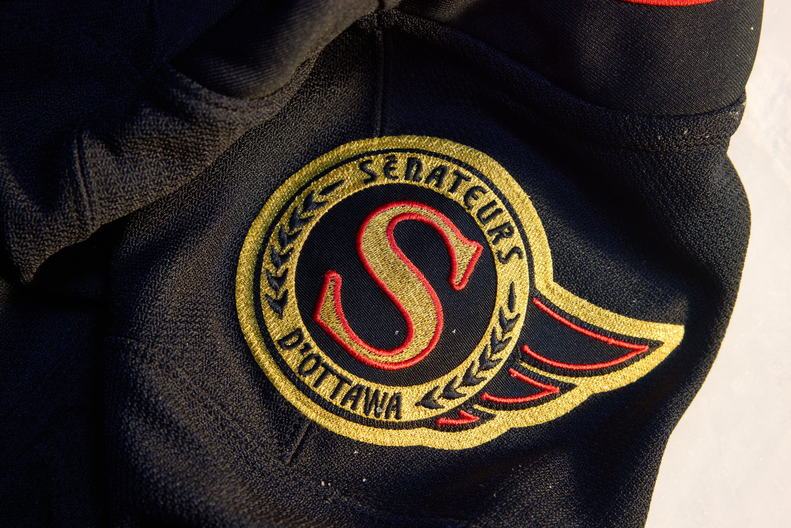
The patches on the jersey with French and English versions on either shoulder.
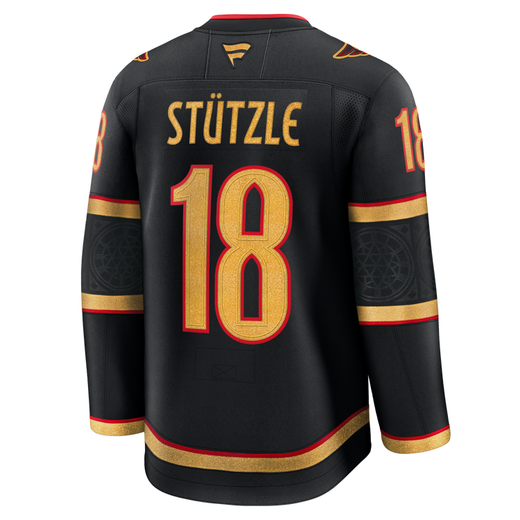
The back of the jersey has a new font that completes the look with Gothic features of windows and doors.
Ottawa will wear these jerseys for the following dates:

Dickson’s Take: Love the take Ottawa used for their jersey. They pulled very well from the iconography of the city of Ottawa and works very well.
Grade: A
Brett: I think it’s pretty good. I love that they leaned into the gold accents while still leaving an accent of red. It’s a good jersey.
Scott: No comment.
Philadelphia Flyers
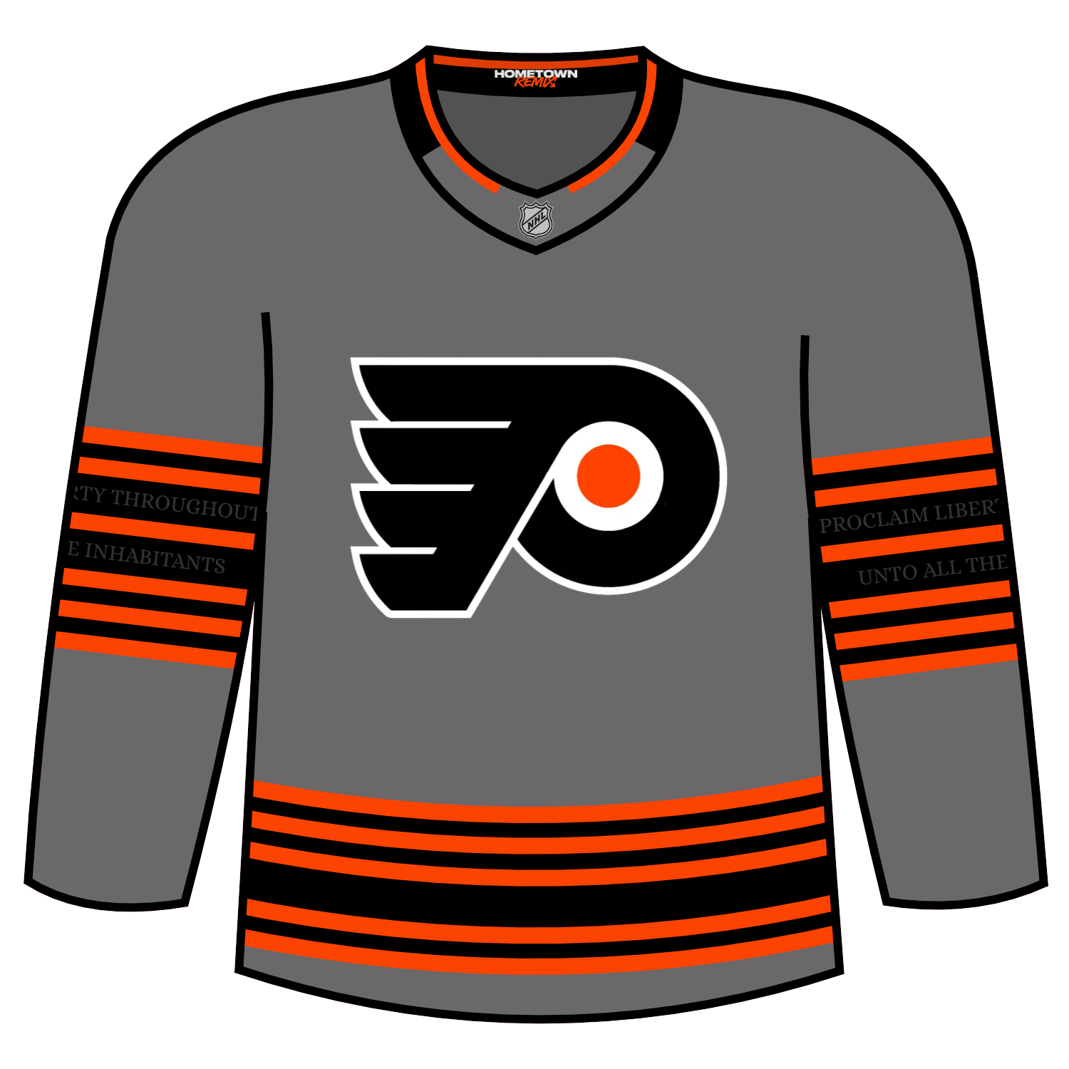
For the Philadelphia Flyers Hometown Remix, the team is calling theirs the “Independence Edition”.
The team is drawing inspiration to the rich history of the city of Philadelphia as well as the 250th anniversary of the United States.
The base colour is a Liberty Gray color and there are accent colors that include a parchment colour with orange. The numbers portray a cracked feature, similar to what is seen on the famous Liberty Bell.
The six stripes on the arm are meant to also be a tribute to the six decades of Flyers hockey, with the thicker black stripes containing the phrase “Proclaim Liberty Throughout All The Land Unto All The Inhabitants Thereof”, which is on the Liberty Bell.
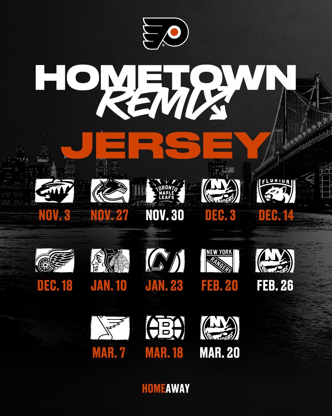
The Flyers will wear their Hometown Remix jersey for the following dates:
Dickson’s Take: Talk about a severe letdown. I understand the Flyers and the fanbase love their logo but this was a perfect opportunity to have used the Liberty Bell logo that came out of the summer during the NHL Entry Draft.
Grade: D-
Brett: There was so much talk about the Liberty Bell for this jersey, and the use of it is fairly minimal. They have the inscription from the Liberty Bell inside the sleeves, which is cool, but that’s only noticeable once you get a close look. I think they could’ve done a lot more here.
Scott: No comment.
Pittsburgh Penguins
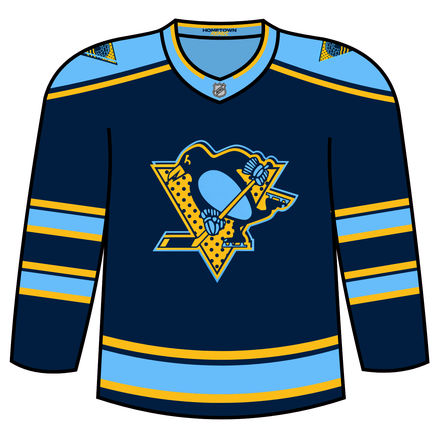
Pittsburgh’s Hometown Remix draws inspiration of pop-art graphic styles from the 1960s while also using a the double blue colours that were worn as main colours until 1980.
The shoulder logos that were also introduced with the yellow alternate last season are also featured in the same style as the crest on the jersey.
This jersey will be worn for the following contests:

Dickson’s Take: I’m very undecided on this look. I think it is far too busy for my liking.
Grade: D
Brett: I think this one is great. It’s clearly a polarizing design, but I think they nailed it. They leaned into the idea of Andy Warhol being from Pittsburgh and honored his legacy here with some unique piping and an alternate logo that fits his style. It’s a great Hometown Remix jersey.
Scott: I definitely respect the fact they wanted to do something different and incorporate a lot from their past, as well as a nod to Andy Warhol, but the polka dots really?
San Jose Sharks
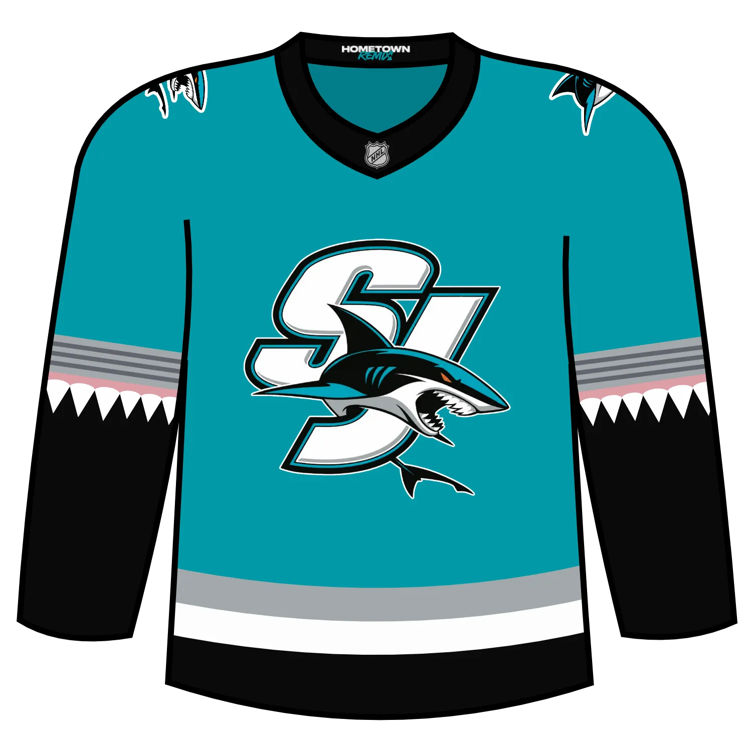
The Sharks themselves really went on this. The Sharks for their version went with a lighter teal colour, more close to the teal from their inaugural season look.
The most jarring, if you want to call it that, is the addition of gums and shark teeth on arms of the jersey.
The main logo on the jersey is an old SJ logo with a shark in the lower corner, while the primary logo has shifted to both shoulders.
The Sharks will wear their Hometown Remix jerseys for the following contests:
- Mon, Nov 2 vs Calgary Flames
- Sun, Nov 15 vs Nashville Predators
- Sat, Nov 21 vs Seattle Kraken
- Tue, Dec 8 vs Seattle Kraken
- Mon, Dec 14 vs Vancouver Canucks
- Sat, Jan 2 vs Toronto Maple Leafs
- Sat, Feb 13 vs Detroit Red Wings
- Sat, Mar 20 vs Carolina Hurricanes
Dickson’s Take: This is nowhere near as bad as it was initially described. I do like the addition of the shark teeth and the return of the lighter teal is also a welcome addition.
Grade: B
Brett: I think it’s a fun jersey. The shark teeth on the sleeves are certainly a standout here and the best part of the jersey. I am not sure if it quite gives me Hometown Remix jersey vibes, but it’s good and well executed for what it is.
Scott: Really like what they did here. Love the Shark look and colors as it definitely stands out! Shark teeth with the gums on the sleeves looks really cool.
Seattle Kraken
The Seattle Kraken for their Hometown Remix made the shoulder logos featured on their home and white jerseys the main logo of the jersey while the S logo has moved to either shoulder.
The logos on the shoulders and anchor logo are put in a cream colour with the stripes on the arms going in a thin teal, blue, and thick cream colour.
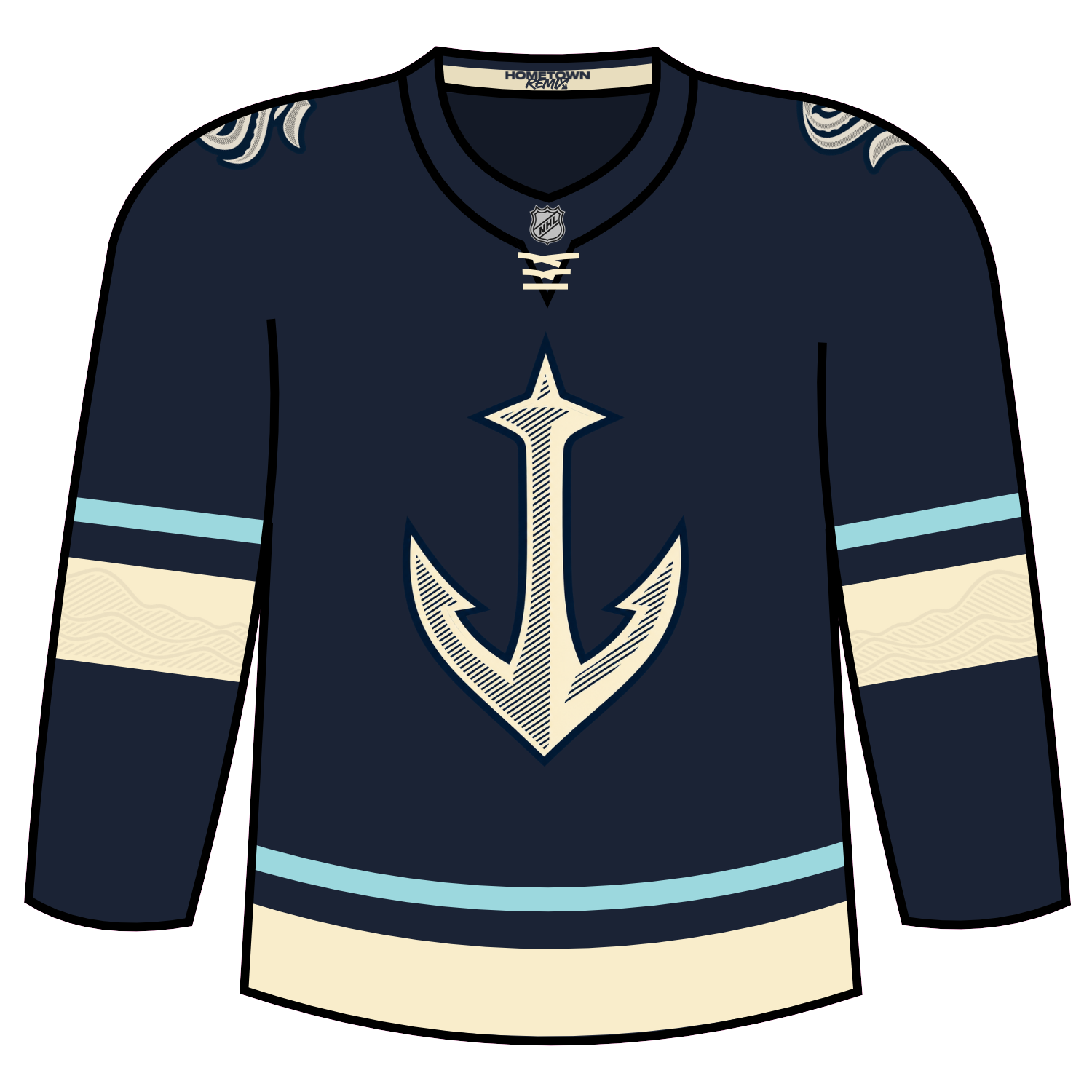
The Kraken will wear there Hometown Remix colour for the following contests:
Dickson’s Take: The anchor logo is what should have been used as the alternate jersey logo on the teal colour. I love that logo for Seattle and hope that can be used for something again in the future.
Grade B+
Brett: I feel a little underwhelmed with Seattle’s. Again, this feels more like a third jersey to me instead of a one-off speciality jersey. I do like the waves and mountain design that gets hidden in the sleeves, that looks great. I’ve said it a few times now, but just feels like they could’ve done more.
Scott: Another FINALLY! The long awaited anchor jersey has arrived and it was done very, very well! A favorite for Kraken fans as the Space Needle is the city’s most significant landmark & anchor pays tribute to fisherman throughout the Pacific Northwest as well.
St. Louis Blues
The St. Louis Blues Hometown Remix jersey brought back the roundel alternate jersey logo that was last seen during the 2015-16 season.
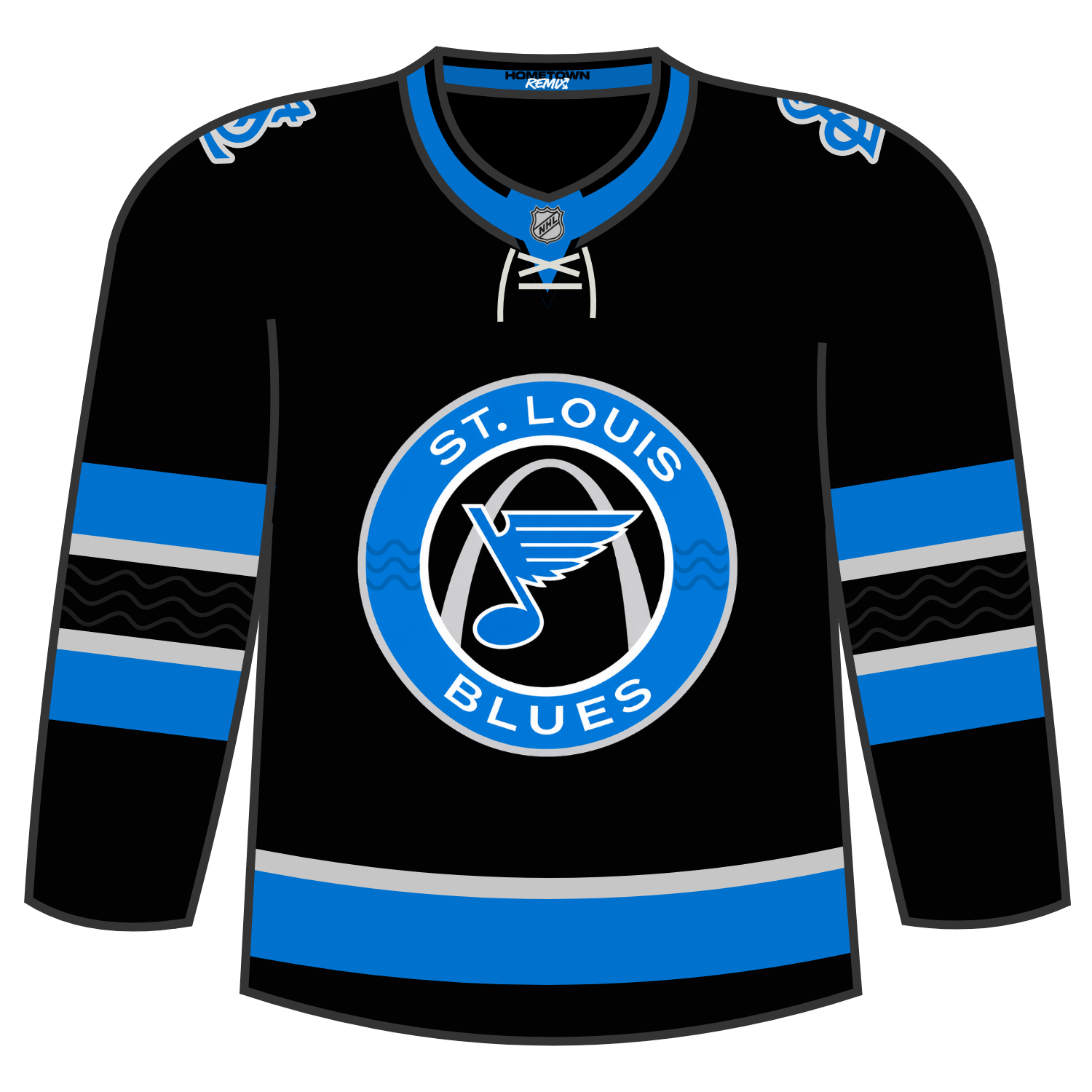
The Blues will wear this jersey for the following contests:
- Nov. 17 vs. Anaheim Ducks
- Nov. 22 vs. Edmonton Oilers
- Nov. 25 at New York Islanders
- Nov. 27 vs. Dallas Stars
- Dec. 2 vs. Pittsburgh Penguins
- Dec. 13 vs. Tampa Bay Lightning
- Jan. 26 vs. Chicago Blackhawks
- Jan. 30 vs. Vancouver Canucks
- Feb. 25 vs. Vancouver Canucks
- March 13 vs. Anaheim Ducks
Dickson’s Take: What a let down again.
Grade: D-
Brett: The black base here doesn’t make sense for me here. The arch logo is cool, and using the baseball vibe “StL” logo on the shoulders was a great choice. But that’s all I really like about it.
Scott: It’s OK. Having the arch of St. Louis and the little Mississippi River waves are a nice touch.
Tampa Bay Lightning
Tampa Bay’s Hometown Remix plays it safe but also uses their iconic Lighting logo as well the crest used from last season’s Stadium Series once again.
The shoulder logos contain the Lightning logo, which has not been seen since the 2013-14 season and the sleeves are given a lightning like sleeve effect. which brings everything together.
Lastly, the storm gray color that was seen on the 2018-2022 returns as a sleeve accent.
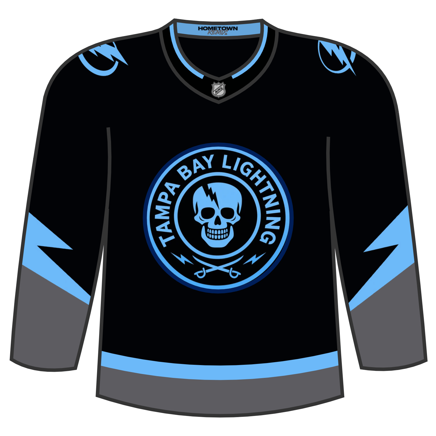
Tampa Bay will wear their Hometown Remix for the following contests:
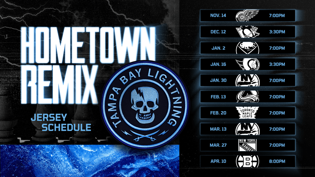
Dickson’s Take: Love that they really went with the Gasparilla theme for this. Ultimately this is more of what the Stadium Series jersey from last season was. My only complaint is the use of the double blue and would have preferred to see the lighter shade of blue used instead but it still works.
Grade: A-/B+
Brett: Tampa loves to do black jerseys and I think they did a good job with this one. Absolutely the right call to go with the Gasparilla logo for the center crest to get that Hometown Remix vibe, and their logo being enlarged as the sleeve design looks awesome.
Scott: Speaking of the Stadium Series, I do like their use of the logo here to give off a pirate vibe.
Toronto Maple Leafs
The Toronto Maple Leafs Hometown Remix jersey plays it very safe while also paying tribute to the 100 years of the team being called the Maple Leafs, despite the franchise having their 100th anniversary as a franchise back in 2017-18.
The logo draws inspiration from the Maple Leaf logo that was first worn 100 years ago and has a remixed feel to it, complete with leaf details and the same pattern is repeated in the sleeves.
The base colour is in a vintage white while the sleeve striping goes in a blue/white/thick blue/white/blue pattern, with a thick blue stripe on the hem.
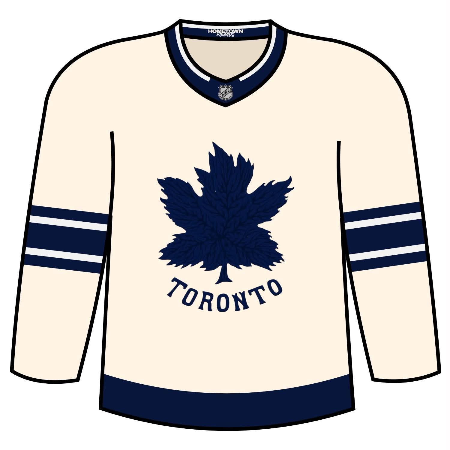
Toronto will wear their Hometown Remix jersey for the following contests:
- Nov. 8 vs New Jersey (introduction night)
- Nov. 19 vs Los Angeles (80s night)
- Nov. 30 vs Philadelphia (70s night)
- Dec. 19 vs Tampa Bay (90s night)
- Feb. 16 vs Carolina (100th anniversary of the Maple Leaf name and crest).
Dickson’s Take: I like the vintage white that was used here. I also like that there is great detail put into the veins of the leaf and on the blue parts of the sleeves. I do not like, however, the fact that there is a fine white outline on the leaf, the Toronto wordmark, the numbers, and the names on the jerseys. It seems like that was a last minute addition and seems unnecessary.
Grade: B-
Brett: This is so close to being a homerun for me. I don’t know what they were thinking by adding the regular white stripes here. This would’ve been an absolutely gorgeous two-tone jersey with just the cream white and dark blue. The leaf vain texture being used throughout the jersey is also great. Just those white stripes taint it for me.
Scott: Solid and clean look for the historic franchise. I especially like the leaf veins on the back numbers.
Utah Mammoth
The Mammoth for their Hometown Remix jersey centers the U Tusk alternate logo on the front of the jersey. The Mammoth logo moves to both shoudlers and under that features rising tusks when the wearer’s arms are down. The hem of the jersey also feautres the Wasatch Mountain Range, that really ties everything together
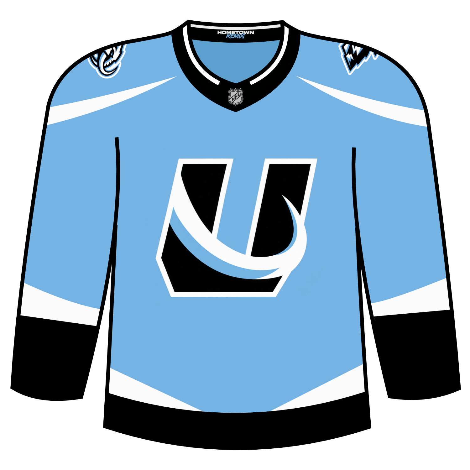
Utah will wear their Hometown Remix jerseys for the following contests:
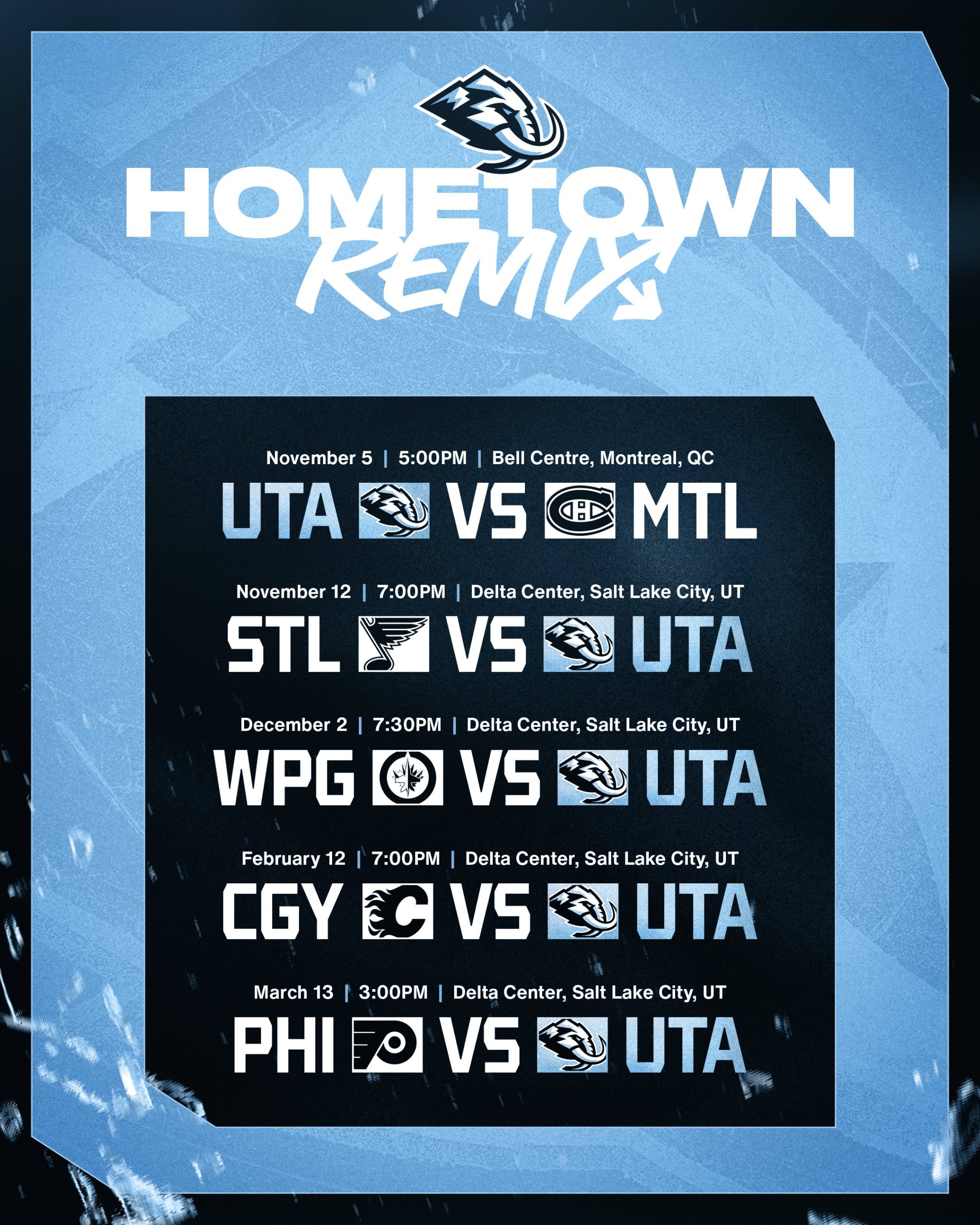
Dickson’s Take: I really like the baby blue colour. While I am not fully in love with the main logo, I do like the tusks look around the collarbones.
Grade: B+
Brett: I really like that they leaned into the mammoth tusks vibe here. The sharp lines on the shoulders, lower torso, and sleeves work collectively and make it all fit together with the logo. The powder blue base is also sleek.
Scott: Can’t go wrong with baby blue, and they sure didn’t in this case… I love the mammoth tusk being incorporated into the U logo.
Vancouver Canucks
Vancouver’s Hometown Remix purportedly draws from Vancouver at night detailing the sky, water, glass, and the home of the Canucks.
It features a stealth-mode orca in deep blues with shining silver eyes. The sleeves carry an abstract deboss of the skyline reflecting in the bay while the hem nods to the lions guarding Lions Gate Bridge, a quiet symbol of strength every time we cross.
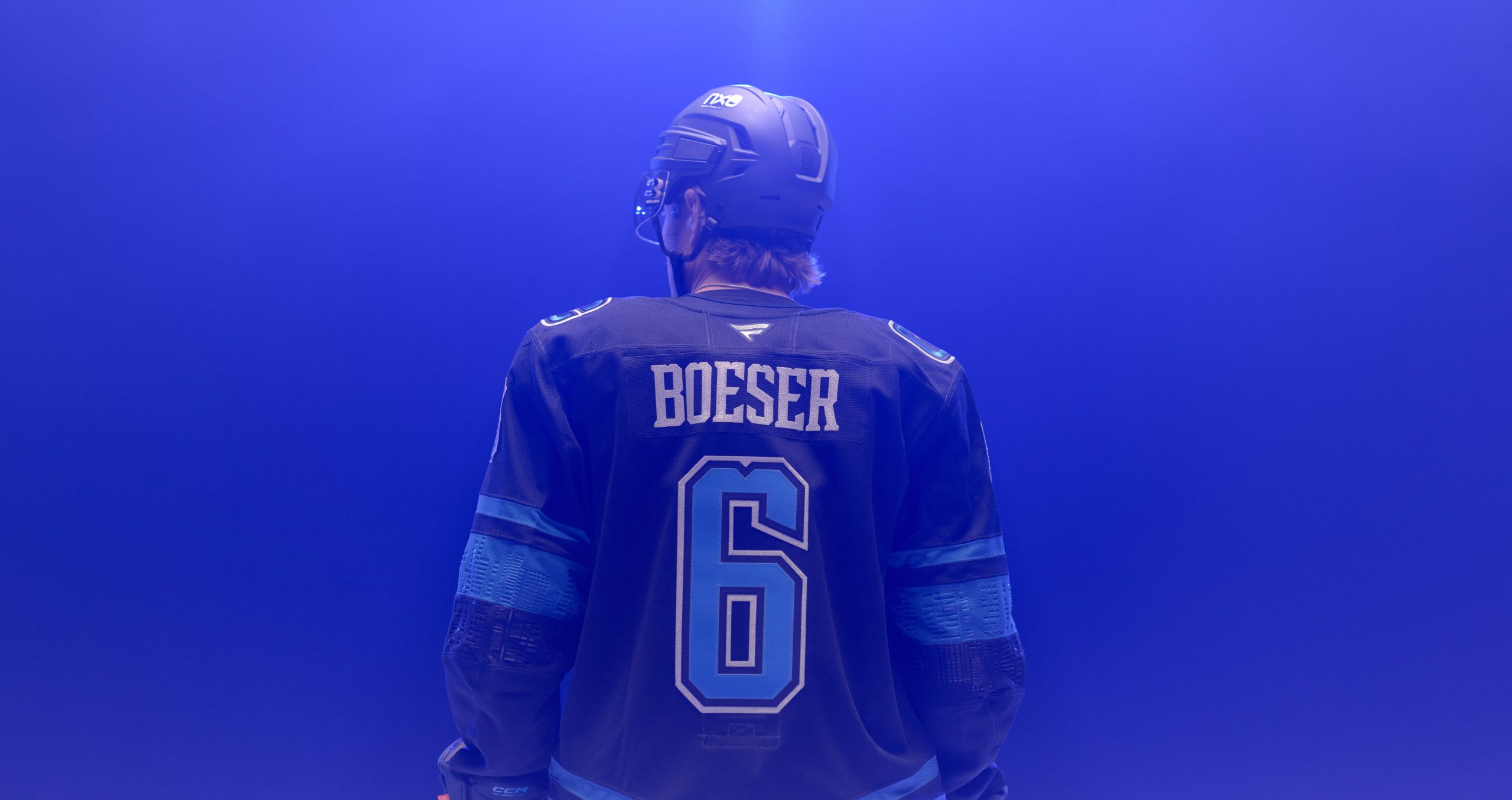
The custom name and number system features a V notch detail that feels handcrafted and hometown giving it a distinct look for the Canucks.
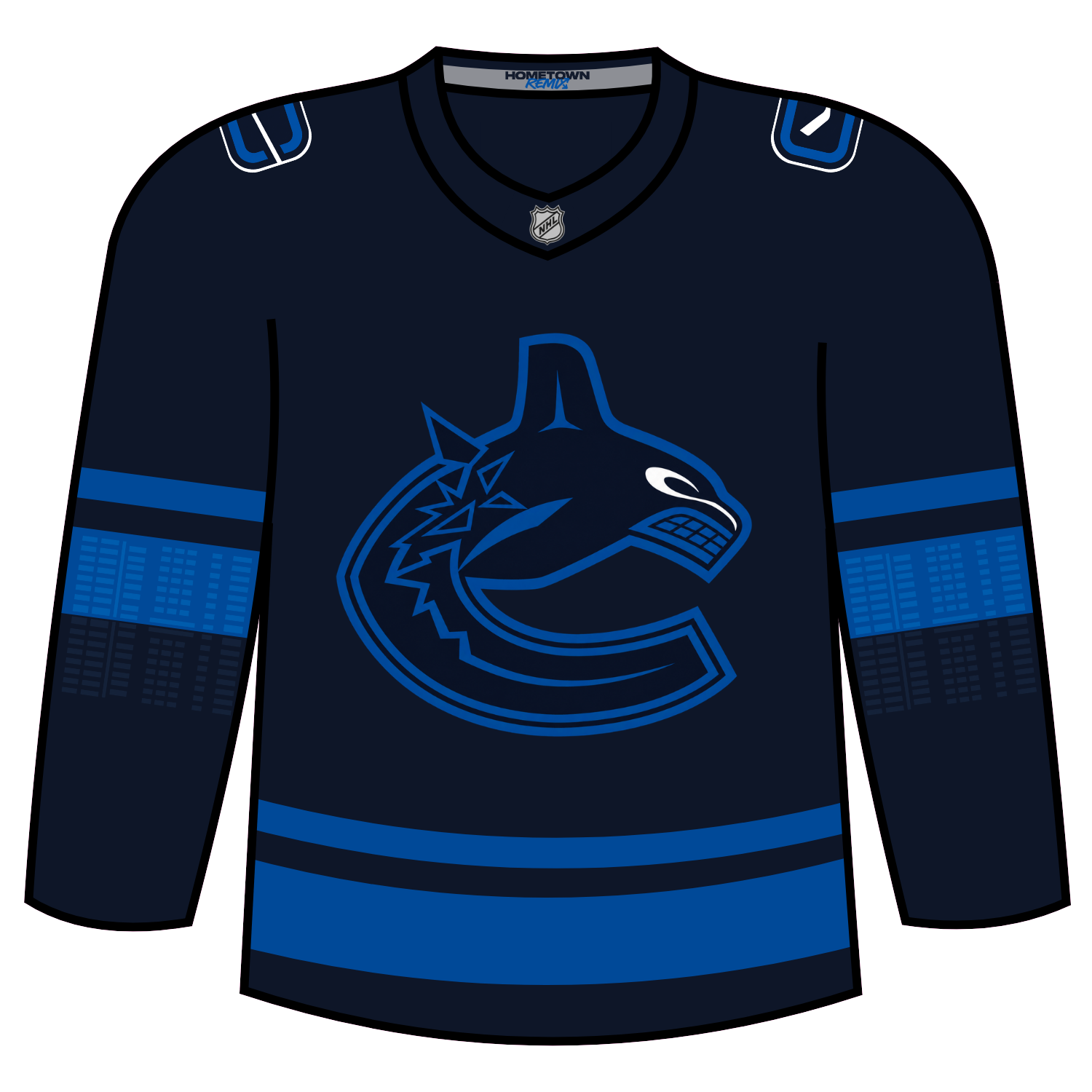
The Canucks will wear the Hometown Remix jersey for the following games:
- Friday, November 13 vs. New York Rangers
- Saturday, November 21 vs. Minnesota Wild
- Friday, December 4 vs. Buffalo Sabres
- Tuesday, February 16 vs. Pittsburgh Penguins
- Saturday, February 20 vs. Colorado Avalanche
- Wednesday, March 3 vs. Chicago Blackhawks
Dickson’s Take: Eh? I’m not keen on this look for Vancouver either. I think this was also a miss. There could been other things that could have been done to do give this a Hometown Remix vibe.
Grade: D
Brett: I personally am not a big fan of this one. Feels pretty boring to me. The one redeeming thing about it is on the sleeves. They made it look like buildings are being reflected onto the water with just a bunch of rectangles, it’s pulled off really well. I wish we could see that creativity on the rest of the jersey.
Scott: No comment.
Vegas Golden Knights
Vegas’ Hometown Remix is very Vegas like. Adding a casino like theme with roulette like striping on the arms, a black base colour with gold striping and a mimics the green felt like yoke pulls this look together.
The Golden Knights logo is given an elevated look to mimic the casino like vibes of Vegas and I do like how Vegas had fun but played it somewhat safe at the time
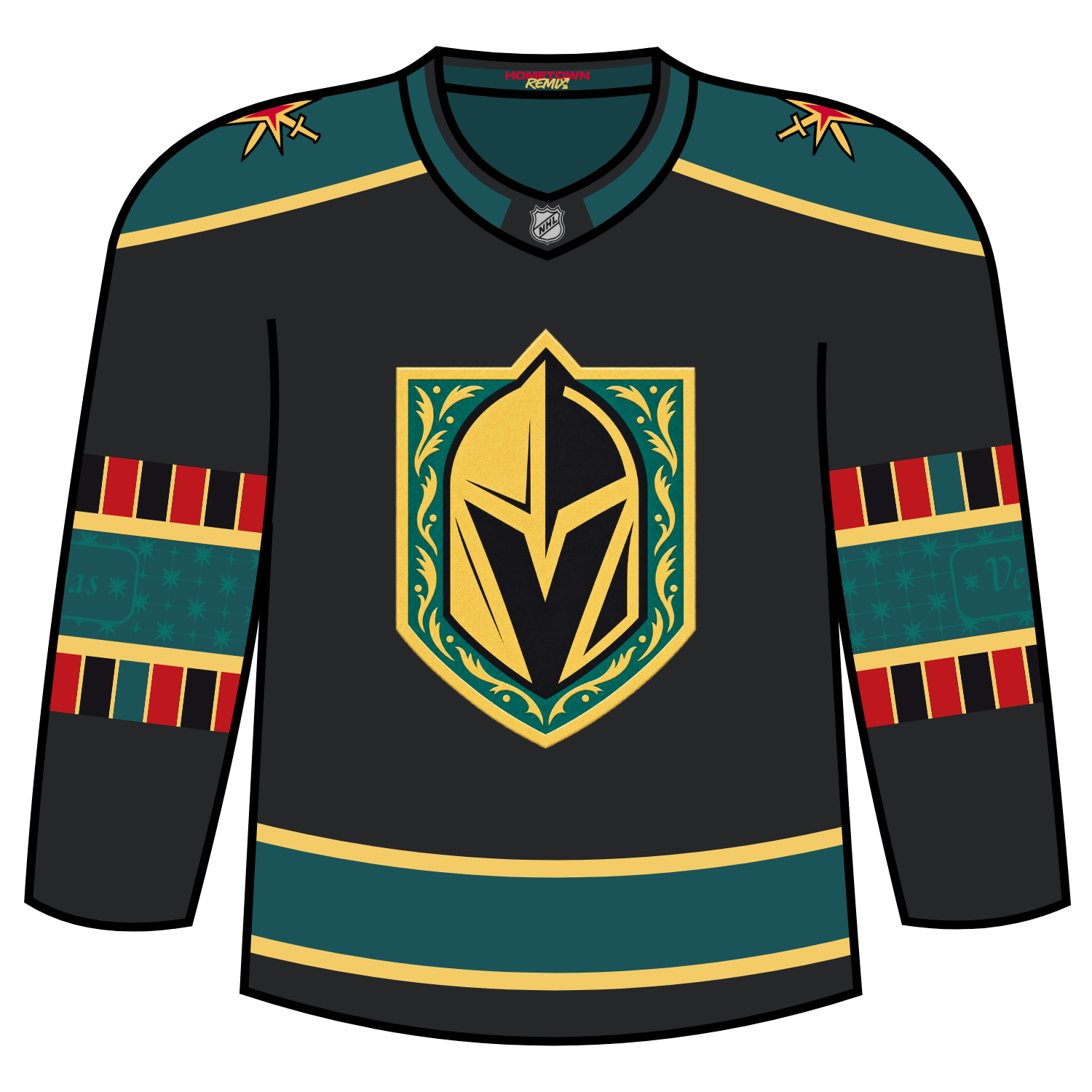
The Golden Knights will wear this jersey for five games:
- November 15 vs. Vancouver
- December 21 vs. Carolina
- January 28 vs. Buffalo
- February 18 vs. Columbus
- March 15 vs. Winnipeg
Dickson’s Take: This one absolutely nails everything Vegas. My only issue is that it is on a black base. If the base colour was like the green on the yoke, it’d be even better. The details of the roulette board on the arms is perfect.
Grade: B+
Brett: This no doubt gives you absolute Vegas vibes. They nailed the idea of a Hometown Remix. Those small designs on the sleeves make it look like the carpet of a casino, and you’ve got the roulette wheel there too, which ties in with their center ice logo this season. Maybe a little busy, but I still think they did a great job here.
Scott: Rounding out my top 10 with a design I really appreciate. A nod to Vegas and its Casino/gambling culture.
Washington Capitals
The Washington Capitals had proba.bly the most anticipated Hometown Remix jersey, with how popular the Reverse Retro program was for the team.
Washington drew inspiration from the city, giving the yoke a marble effect, while bringing back the slate blue colour from the 1990s.
Returning as a main logo is the Capitals Dome logo that was used up until the end of the 2006-07 season while having white/black/bronze/black/white striping on the arms with bronze/black/white striping on the hem. The marbling effect is repeated on the white stripes of the jersey as well.
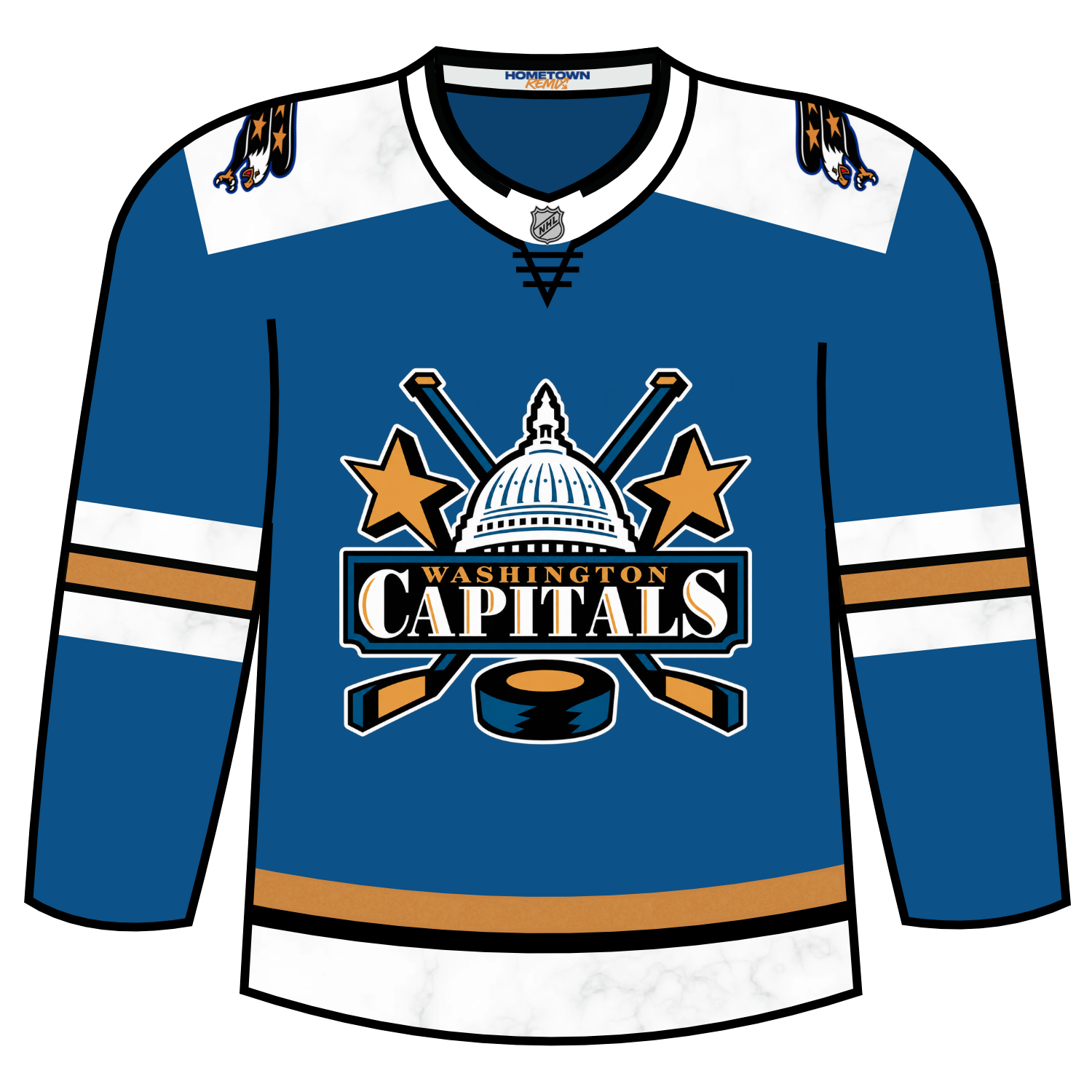
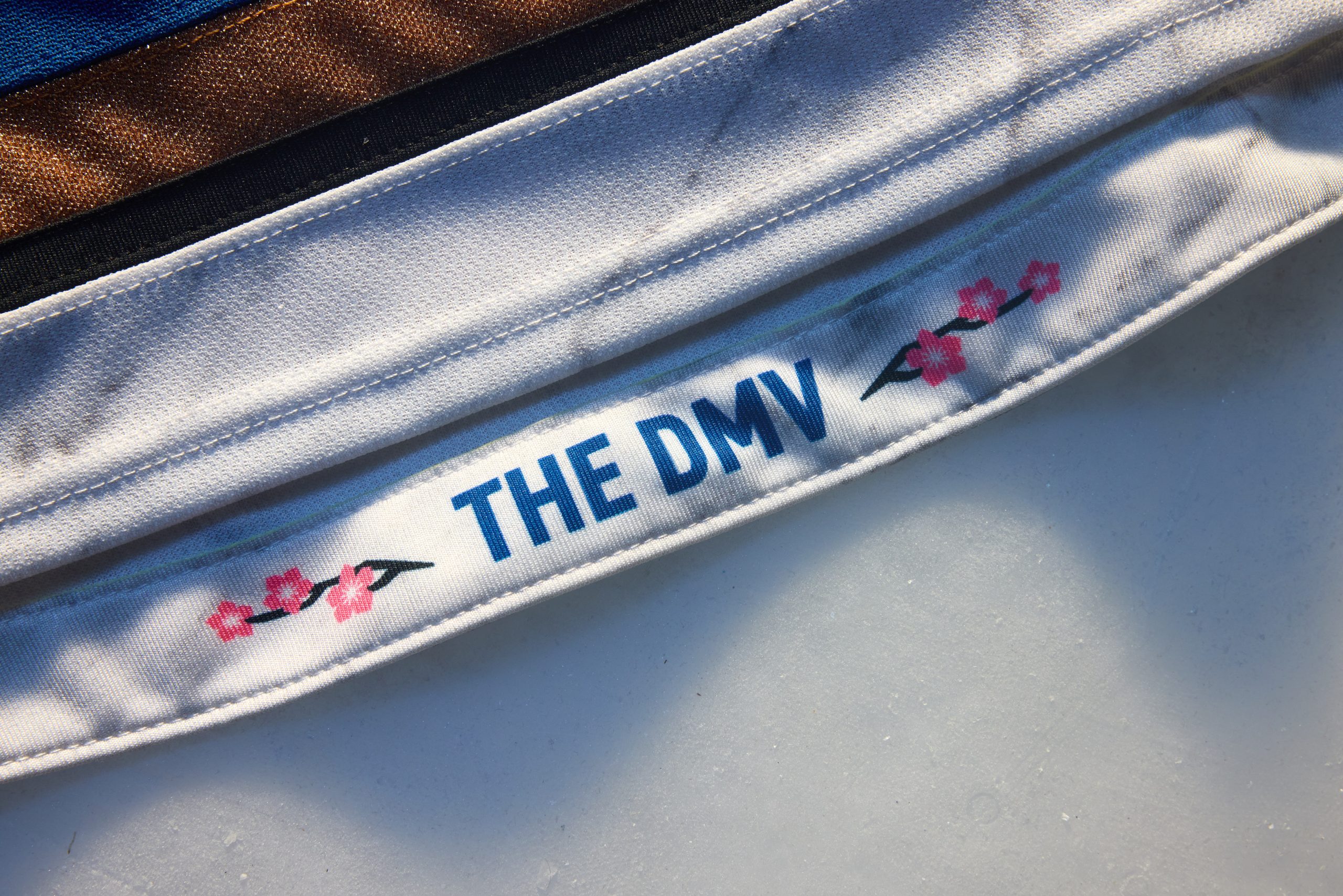
On the interior hem of the jersey, it contains the phrasing “The DMV” surrounded by a stem of cherry blossoms on either side.
The Capitals will wear this jersey for 11 contests:
- Nov. 7 vs. Florida Panthers
- Nov. 25 vs. Philadelphia Flyers
- Dec. 1 vs. Vancouver Canucks
- Dec. 28 vs. Edmonton Oilers
- Jan. 12 vs. Vegas Golden Knights
- Jan. 14 vs. Carolina Hurricanes
- Feb. 2 vs. Winnipeg Jets
- Feb. 23 vs. New York Rangers
- March 3 vs. Carolina Hurricanes
- March 15 vs. Tampa Bay Lightning
- March 23 vs. Detroit Red Wings
Dickson’s Take: Absolutely love what Washington has done for their Hometown Remix jersey.
It’s a minor complaint but I would have liked to have seen the use of cherry blossoms be used on the exterior of the jersey but it’s a not deal breaker either.
Grade: A+
Brett: One of the best of the collection here. The unique marbling design is what puts it over the top for me, something we’ve never seen on a hockey jersey before. You know exactly what they are taking inspiration from with each detail. They did an excellent job.
Scott: Representing the DMV proudly! A really sharp design that deserves its spot near the top. Love the marble look, the shade of blue, and return of the Capitol dome logo.
Winnipeg Jets
The last team that will be reviewed for the Hometown Remix is the Winnipeg Jets.
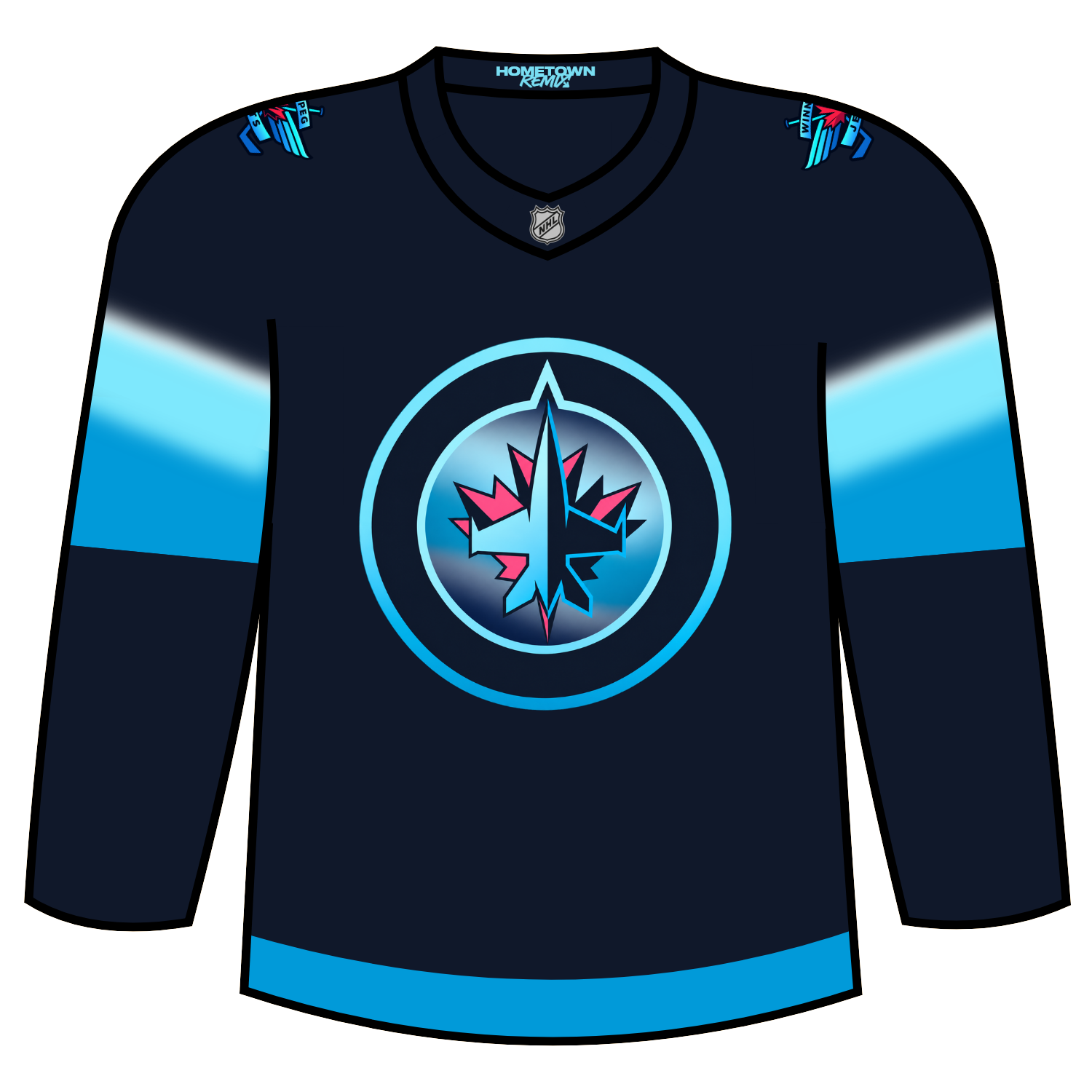
Winnipeg’s Hometown Remix jersey draws inspiration from one of Manitoba’s but also North America’s most spectacular natural wonders: the Northern Lights.
The design captures the colour and movement of the Aurora Borealis, bringing a distinctly Manitoban element to the team’s look.
Adding the effect of a very faint light green colour really brings that Aurora Borealis look into light.
Winnipeg will wear their Hometown Remix for the following contests:
- Nov. 17 vs. Ottawa
- Nov. 21 vs. Vegas
- Nov. 23 vs. Utah
- Dec. 10 vs. Chicago
- Jan. 19 vs. Minnesota
- Jan. 21 vs. New York Rangers
- March 23 vs. Seattle
- March 25 vs. Colorado
Dickson’s Take: Initially seeing the jerseys in retail images, it looked to be pretty boring. Now knowing that there was a Northern Lights theme to it, I love it even more.
Grade: B+
Brett: Oh they could’ve done so much more with this. They said they were going with a northern lights theme, but if you see this without knowing it, it just looks like a two-tone gradient of their regular jersey colors. Should’ve leaned even more into the northern lights idea with more colors instead of just shades of blue. It’s okay as a jersey, but I am underwhelmed.
Scott: The Northern Lights look turned out surprisingly cool!
Overall Review:
While I loved what most teams did with the storytelling of the goal of Hometown Remix, there are teams that seemed to phone it in entirely (New Jersey and Detroit), or they went with unused ideas from the Reverse Retro programs.
I hope that the NHL and Fanatics run this program back for a second edition and teams can then really have even more fun and do something that adds to the Hometown Remix program.
