Heading into the 2025-26 season, there are numerous teams bringing in new jerseys. Some are new looks for both at home and on the road, while others introduce jerseys to celebrate anniversaries, and then those bringing in a new alternate look to their rotation.

New Home and Roads
Boston Bruins
For the Boston Bruins, they are two years removed from their 100th anniversary and entering a new era for the Bruins, new home and road jerseys were a part of that evolution.
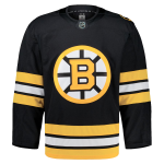 For both the home and road jerseys, the Bruins returned to the logo they used for their 100th anniversary, but instead of gold, the Bruins use their standard yellow. The Bruins also make a nod back to the jerseys they wore from 1974 through 1995. Both the stripping on the sleeves and on the bottom of the jerseys mimic the way they were up until 1995.

One difference for both jerseys is on the shoulder patch. On the left shoulder is the bruin, but on the home jersey it says “BRUINS” while on the road jersey it says “BOSTON.” This is a nice little touch, and something that is done by other teams like the Florida Panthers.
Overall, I really like these jerseys. They are solid jerseys that are both retro and forward looking. If I were to have the opportunity, I’d get the road jersey. The road jerseys don’t get a lot of love like the home jerseys do.
St. Louis Blues
The St. Louis Blues went the same route as the Bruins, but with a bit of a twist. For the Blues they went back to their Winter Classic jerseys from 2017 and and 2022 for their home and road jerseys respectively. However, this also acted as a promotion and as a demotion too.
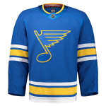 For the Blues home jersey, they promoted their alternate jersey that they’ve been wearing since 2018 after debuting it at the 2017 Winter Classic. One change they did do to the home jersey was take away the white border from around the logo on the chest. However, with this jersey being promoted as the new home jersey, the Blues home jersey since 1998, including the Reebok years as the changes were very minimal, is being demoted as the new alternate jersey.
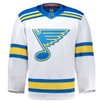 For the road jersey, the Blues bring back their 2022 Winter Classic jersey, but this time they replace the cream base with a white base that is standard with all road jerseys in the NHL. Outside that change, this is a very solid road jersey for the Blues.
For the historical context for the Blues, both of these jerseys also harken back to the Blues early years from their debut in 1967, so just like with the Bruins, these jerseys pay tribute to their past with a look to the future as well.
Overall, I think this was a great move for the Blues. Both jerseys look amazing, and if I were to get one, I’d get the new road jersey as I already have the home jersey from when it was the alternate jersey, slight change be damned.
Utah Mammoth
For the Utah Mammoth we knew change was coming after being the Utah Hockey Club for their inaugural season last year, and that change came back in May when their new name and look was unveiled.
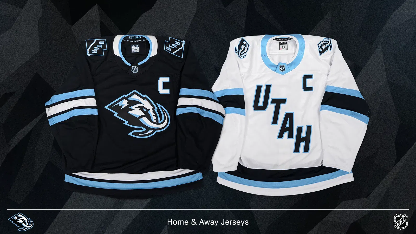
When unveiling their new jerseys, the Mammoth showed that they were sticking with the base look from their inaugural year but with some minor changes. For the home jersey, they have put their Mammoth primary logo as their new crest with a new updated Utah secondary logo going onto the shoulders where the inaugural patches were.
For the road jersey, the Mammoth are keeping the UTAH wordmark on the front of the jerseys, but the font has been updated to the Mammoth’s new font style. The same can be said for the names and numbers on the back of the jerseys for both the home and road as well. Also for the road jersey, the Mammoth primary logo is on both shoulders of the jersey.
Overall, these jerseys are ok. You knew they were going to keep them basic for the style of the jersey. However, the road jersey is disappointing with the wordmark remaining on the jersey, but I do like the new font style that the team is using now. I’d probably buy the home jersey for the collection personally.
Carolina Hurricanes (Road Only)
For the Carolina Hurricanes it was rumored that they would be getting a new road jersey as owner Tom Dundon was not a fan of them. Well, the Hurricanes delivered a new road jersey, and if you liked the 2023 Stadium Series jersey they wore, then you’ll like these.
 The Hurricanes essentially did a color swap but with some modifications. For the sleeves, where they were grey, the Hurricanes made them blackish grey instead and put white on the lower portion of the sleeves, and with the red remaining on the upper portion of the sleeves. The fonts from the Stadium Series jersey is returning as well.
On the shoulders which were also grey, the Hurricanes made them white, and for the North Carolina flag, they made it red compared to black on the Stadium Series jersey and their current home jersey. The Hurricanes also debut a new shoulder patch of a vintage looking Stormy strutting on the right shoulder. It’s a unique move given how no team has ever really put their mascot on their jerseys in patch form.
The biggest thing that will need some getting used to is the Hurricanes logo on the front. Going with the same two tone logo that they used in 2023 for the Stadium Series is a unique choice, and one that a lot of people have pointed out as a little off putting.
Overall, it’s not a bad jersey. It’s definitely better than the road jersey they’ve been wearing since 2019, but honestly, I would have really of loved a white version of their current home jersey. I think that would have been so much better personally speaking.

New Alternates
Edmonton Oilers
Going into alternate jersey territory, we start with the Edmonton Oilers. For the Oilers, they went for one season without an alternate jersey, and then during this past offseason a leak came out that the Oilers could be getting a new alternate jersey. Well, the rumors were true, and the leaked photo of the jersey was true as well.
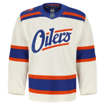
The Oilers introduced us with a cream jersey with large blue and small orange stripes on the lower portion of the jersey and on the sleeves. One of the unique parts of the jersey, in my opinion, is the shoulders. Going with a dominate blue on the shoulders but adding an orange stripe on both the front and back while also giving us a blue stripe underneath the orange is kinda cool and very different from what we normally see on a hockey jersey.
Also on the right shoulder is a patch that shows an oil rig with “EDM 1979” and “OIL COUNTRY.” It’s a nice patch that blends well with the jersey.
For the front of the jersey, the Oilers put their name on the front of the jersey with orange streaks both above and below the team’s name. This also creates and introduces a new and unique wordmark for the Oilers as well, and I’ll be honest, it’s definitely an improvement from their current bland wordmark that they’ve been using since the 2017.
Also, for the players names and numbers, the Oilers are using a completely new font, and I really like it. It gives it a little bit of an edge to it, and it goes well with the jersey as a whole.
At first glance I was confused by this jersey for the Oilers, but after taking some time to look at it, I’d like to see it in action, but if the opportunity arose to get one, I’d probably get one.
Ottawa Senators
In Ottawa, the Senators have been teasing a potential new jersey when they first showed it off to their season ticket holders at an event. then, before training camp started they announced the new alternate jersey, but in a more unusual way. The Senators unveiled the jersey through a more teaser like video and in a media only unveiling with Senators legend Chris Phillips.

This is the best look that we have of the new alternate jersey, and the only picture that the Senators has put out online of it too. However, if you want to look at more of some of the finer details, check out the teaser video they released back a few weeks ago.
As for the jersey itself, the Senators are going back to a red base alternate jersey for the first time since 2020, which was also the last time the Senators wore red as a primary color as well. This also marks the first alternate jersey for the Senators since rebranding back to their original look back in 2021.
The Senators put a lot of work into this jersey including the finer details in the sleeves, and the way they utilized gold on the jersey for the piping on the bottom of the jersey, on the sleeves and shoulders, and on the names and numbers. The gold really pops out in a positive way. Also, when we look at the Senators logo on the crest, the amount of detail they put into the Senators logo is outstanding.
The way they make the logo pop with the amount of detail they did to make certain elements of the logo stand out was really well done, and quite frankly, I hope it leads to more teams doing this with their jerseys in the future because to make their primary logos on their jerseys stand out more with details would be really cool.
The Senators are also going with a new font style for the names and numbers on the jersey. This is the first time since the rebrand that the Senators have gone with a more distinct font style since they introduced their first alternate jersey back in 1997 that lasted all the way to 2017.
I know there is still a lot we want to see when it comes to these jerseys, but from what we have seen, these are some really top notch jerseys for the Senators. I’d definitely would get one if I can.
Seattle Kraken
Possibly one of the greatest buildups on social media, but one of the biggest letdowns out of almost all, there is one more that was a letdown, of the jerseys that were unveiled this past offseason. The Seattle Kraken debuted their first ever alternate jersey, and man… just take a look.
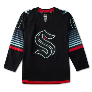
The Kraken debuted a black jersey with very minimal details, but is also a blacklight activated jersey, which lets be honest, that gimmick will get old real quickly. A lot of us were hoping the Kraken would do something with their secondary anchor logo, and they really dropped the ball here.
But let’s still talk about it, shall we?
So, as I already mentioned, the Kraken unveiled a black jersey that has red piping on the bottom of the jersey, and has teal and black piping with one red stripe on the sleeves. The primary logo has been given a more two-tone look to it so when the it is blacklight activated, it has a more distinct look to it. The numbers and the names on the back get this same treatment too.
Overall, this jersey is so disappointing. They’re just as bad, if not worse, than what the Dallas Stars used to have these last several seasons.
Washington Capitals
Time now for the Washington Capitals, and as I had previously reported back in March, the Capitals were going to going back to the Red Screaming Eagle, but what wasn’t clear at the time was how the jersey was going to look. I had assumed the safer bet was to bring back the Reverse Retro 1.0 jersey that was widely popular back in 2021. However, I was wrong about that. So much for being a safe bet.
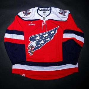
The Capitals did bring back the Red Screaming Eagle, but with a different style jersey. The design they decided to go with pays tribute to the Capitals original look while also giving it a bit of an update for today. Going with the red, white, and navy scheme with red being the primary base. The bottom of the jersey has the original navy, white and red piping, and that is used on the sleeves as well, but underneath the red stripe, we have more navy going down to the end of the sleeve. Obviously with the original jerseys the sleeves didn’t have any piping on them on the main part of the sleeve, and were covered with stars down the sleeve.
For the shoulders, the Capitals also bring back the white shoulders of their original retro red jerseys, but with a twist as this time they feature navy piping around the shoulders. Also on the shoulders, we have the return of the red, white, and blue version of the Dome logo that also debuted with the Red Screaming Eagle back in 2021.
For the names and numbers, the Capitals decided to continue their use of the current font style. It’s ok, but I thought it would have been cool to bring back the font style from the Screaming Eagle jerseys, especially since the Dome logo’s font was never changed. However, I get it. It fits better with the team’s current branding.
Overall, it’s a nice jersey, and I’m looking forward to seeing it in action on October 17th against the Minnesota Wild.
To read more on the Capitals new alternate jerseys, you can read our article from the day the jerseys were unveiled – Capitals Unveil New Alternate Jerseys

Celebrating Anniversaries
Chicago Blackhawks – 100th
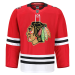 Going into the anniversaries that are taking place this season, the first jersey we got became an instant dud. For the Chicago Blackhawks, they are one of three teams celebrating their 100th anniversary, and for their centennial the Blackhawks decided to do a special home jersey.
For the jersey, all the Blackhawks did was add gold trim around their primary logo and on the numbers on the back of the jersey. They also placed their 100th anniversary logo onto their right shoulder.
Overall, this jersey is a massive letdown. Especially when paying tribute to their 100th anniversary. Between this jersey and the Kraken’s new alternate, the Blackhawks are definitely the bigger let down.
Detroit Red Wings – 100th
For the Detroit Red Wings, they are also celebrating their 100th anniversary, and their centennial jersey is amazing.
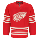
The Red Wings unveiled this red jersey and the details are simply spectacular. They took elements from their hundred years in Detroit and found creative ways to incorporate them into this jersey. The Red Wings giving nods to their beginnings as the Detroit Cougars and brief time as the Detroit Falcons before becoming the Red Wings in 1932 was very cool. I also love how they have a brown leather tag on the front of the jersey to pay tribute to the leather that was used for the gloves and pads back in the day.
For the crest on the jersey, the details with the stitching is gorgeous. The way it’s done as a tribute to how the logo looked back in the 1930’s is simply outstanding. The attention to detail to make that happen truly is awesome.
Overall, this is a jersey that celebrates it’s centennial perfectly, and if I can, I’d get it for my collection.
Minnesota Wild – 25th
For the Minnesota Wild, they are celebrating their 25th anniversary, and they are doing it in a very simple, but effective way.
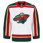
The Wild did the perfect thing and they brought back their original white jersey from when they debuted in 2000 and wore all the way through 2013.
The only real difference they made to this jersey was replace the beige with gold for the piping and the logo on the jersey, and it makes the jersey pop so much better than before.
Also, the return of the original fonts for the names and numbers is amazing to see as well.
Overall, great move by the Wild, and I would get one of these jerseys for my collection.
New York Rangers – 100th
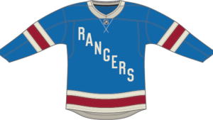 For the New York Rangers, they are the third team to be celebrating their 100th anniversary, and just like with the Red Wings, the Rangers looked to their past for their centennial jersey.
The Rangers go back to 1926 with their centennial jersey as they utilize the same colors, wordmark font and font style for the name and numbers on the back that they used back then. It’s a very simple and touching tribute for the Rangers to show where they started from to where they are now.
Overall, it’s a solid jersey for the Rangers. I probably wouldn’t get it, but that’s because I still want to get the Lady Liberty jersey for my collection.
San Jose Sharks – 35th
With our final jersey that was unveiled, the San Jose Sharks bring back their first ever alternate jersey to celebrate their 35th anniversary.
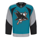
The Sharks brought back the jerseys they debuted as an alternate in 1997, but became their full-time jersey in 1998 and was worn through 2007. The Sharks are billing this jersey as Heritage 2.0 after originally brining back their inaugural jersey for their 25th and 30th anniversaries.
For the Sharks, the only real change they made was that they replaced the silver fabric with grey, and while I may find that disappointing, I also get it. When they brought this style back in 2021 for Reverse Retro 1.0, they used grey as the base instead of silver, and it worked. So going with grey this time around makes sense.
The Sharks, just like the Wild kept it simple by keeping everything the same, but also doing minor tweaks to help improve the jersey.
Overall, it’s a great jersey, and I would get this for my collection to go with the Heritage 1.0 jersey I got 10 years ago.
So these are all the jerseys that were unveiled, so far, for the 2025-26 season. Which jerseys are your favorites?

TXHT may earn an Affiliate Commission if you purchase something through Cool Hockey and Oats Overnight ads/links in this article.